Lead Generation Forms: 15+ Real Examples From Ecommerce Brands
An effective lead generation form gets three things right at once: it shows the right offer, to the right visitor, at the right moment. Most ecommerce brands focus on just the offer — a 10% discount — and ignore the other two. That’s why the average popup converts at 2–3%. Brands that nail all three consistently hit 5–7% and above.
The form itself is just the surface. What makes it work is the system behind it — targeting, clear UI, gamification, and continuous A/B testing. Below is a practical guide to improving your on-site lead capture — from choosing the right form type and timing to testing what actually moves the needle.
What Do Lead Generation Forms Actually Do
A lead generation form on a website might look like it exists just to collect email addresses. It does that — but the best forms do much more.
Capture Contacts at First Touch
Most ecommerce visitors won’t buy on their first visit. A lead form turns anonymous traffic into addressable contacts you can nurture over time. The key is making that first exchange feel worthwhile.
Enlightened Equipment, an outdoor gear brand with 2 million yearly visitors, achieved 20x growth in new subscribers after switching to Maestra. Their subscriber conversion rate jumped from 0.37% to 6.1% of website visitors — more than double the ecommerce average. The secret wasn’t a complicated mechanic. They A/B tested two lead forms: a guaranteed 10% discount vs. a sweepstakes entry for a free sleeping quilt. The discount won — generating 187.8% more leads, 29.8% higher AOV, and 33.3% more orders.
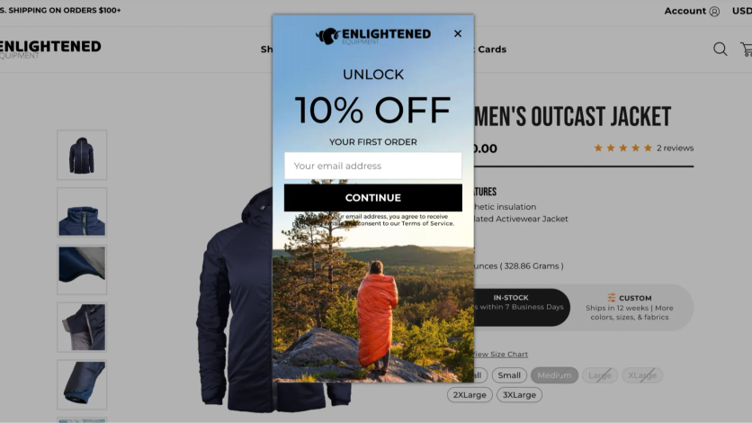
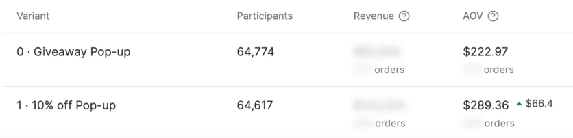
A/B test results showing the 10% discount outperforming the sweepstakes across every metric

Qualify Leads and Collect Preference Data
The best lead forms don’t just collect an email — they help the visitor find what they need and give you data to personalize everything that follows.
Product-picker quizzes are especially powerful here. The visitor answers a few qualifying questions — what they’re looking for, their preferences, their use case. Then the form either shows personalized recommendations right away or asks for an email to send a curated selection. The visitor feels helped, not sold to.
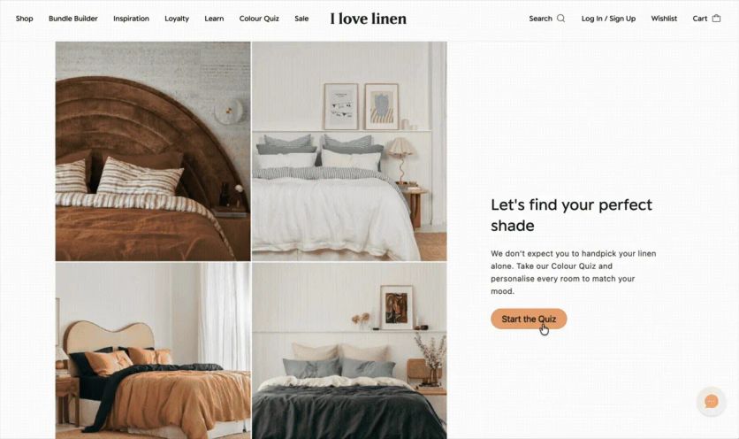
I Love Linen, an Australian linen brand with 400K email subscribers, launched a product quiz that displays real-time product options as customers answer preference questions. The quiz collected 4% of all November leads, and 22.6% of quiz starters provided both their email and phone number — far higher than a standard form.

Grow Engagement Through Interactive Formats
Gamified forms — mystery boxes, wheels of fortune, interactive quizzes — spark curiosity and get people to engage even when they had no intention of subscribing. The playful format lowers resistance and makes sharing an email feel like participating in something, not giving something up.
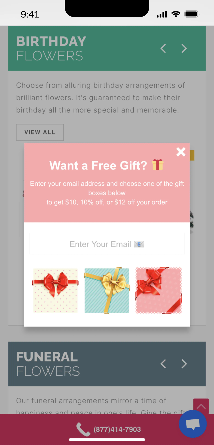
Blossom Flower Delivery doubled lead generation by replacing a standard discount popup with a gamified mystery gift box. Visitors choose from several secret gift boxes, enter their email to reveal what’s inside, and receive a surprise bonus. The result: a 6.72% lead conversion rate — more than double the ecommerce average.
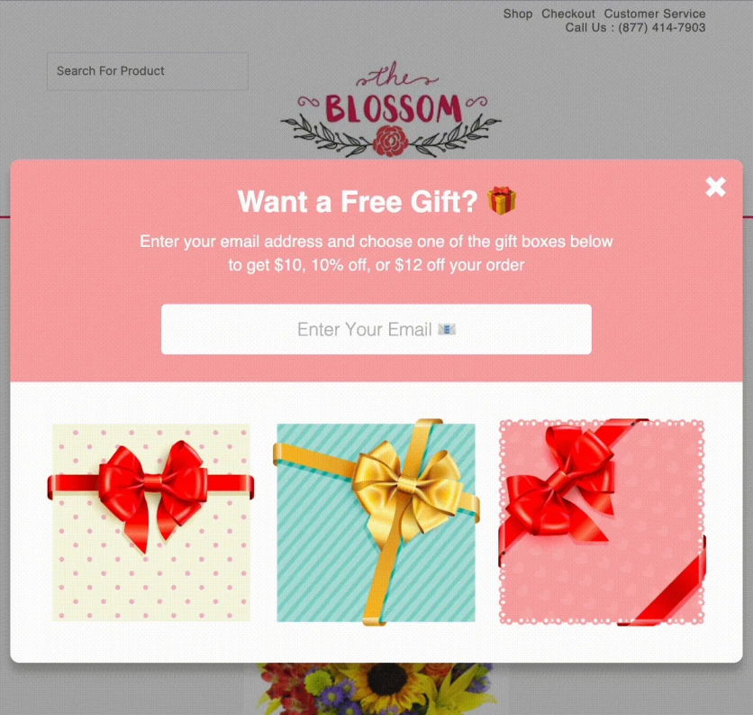
Blossom Flower's gamified lead form doubled lead generation vs. a standard discount popup
Collect Additional Customer Data
Lead forms have one more goal beyond capturing an email — collecting information that makes your future marketing more relevant. A pet store can ask for a dog’s breed to recommend the right food. A fashion brand can ask about style preferences. And almost any brand can collect birthdays to trigger a gift campaign.
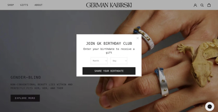
German Kabirski, a jewelry brand with 60,000 customers worldwide, runs a cross-channel birthday enrichment flow. During the welcome email sequence, customers receive an invitation to share their birthdate. Clicking the link opens a popup on the website that asks for birth month and day only — no year required, a deliberate choice that lowers the barrier. The data flows automatically into the unified customer profile and triggers a three-part birthday campaign: one email a week before, one on the day, and one three days after — each with an individual promo code.
What Types of Lead Generation Forms Work in Ecommerce
There’s no single format that works for every store. The right choice depends on your traffic, catalog size, and what you’re optimizing for.
Embedded Forms
Permanently placed on the page — usually in the header, footer, or within article content. They blend with the design and don’t interrupt browsing. The tradeoff: they’re easy to scroll past.
Embedded forms work best as a passive safety net — they catch visitors who are already interested enough to look for a signup option. They’re not great at proactive lead capture.
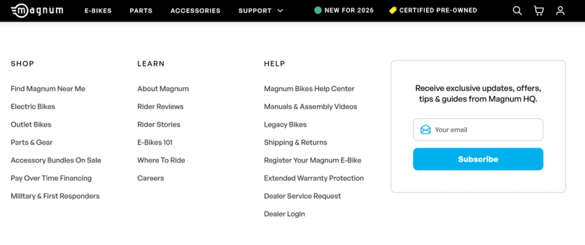
Magnum Bikes, an e-bike brand that doubled online orders after switching from Klaviyo to Maestra, places a subscription form in their website footer. The form invites visitors to receive exclusive updates, offers, tips, and guides — a simple value exchange that sits permanently at the bottom of every page, catching interested visitors without interrupting their browsing.
Pop-ups and Overlays
Pop-ups appear over the content — either in the center of the screen or to the side without blocking the page. They’re the workhorse of ecommerce lead capture because they’re hard to ignore.
Center-screen pop-ups grab attention but can irritate visitors. Two things matter: the popup must be easy to dismiss (close button in the upper-right corner, where users instinctively look), and it should only appear to visitors likely to find it relevant.
JOLYN, a swimwear brand with 1 million subscribers, increased email capture by 21% with AI-optimized popups. The platform analyzes visitor behavior in real time and dynamically adjusts the offer — showing 10%, 15%, or no discount depending on how likely the visitor is to convert. The popup also collects preference data (beach vs. pool swimwear) that feeds directly into personalization.
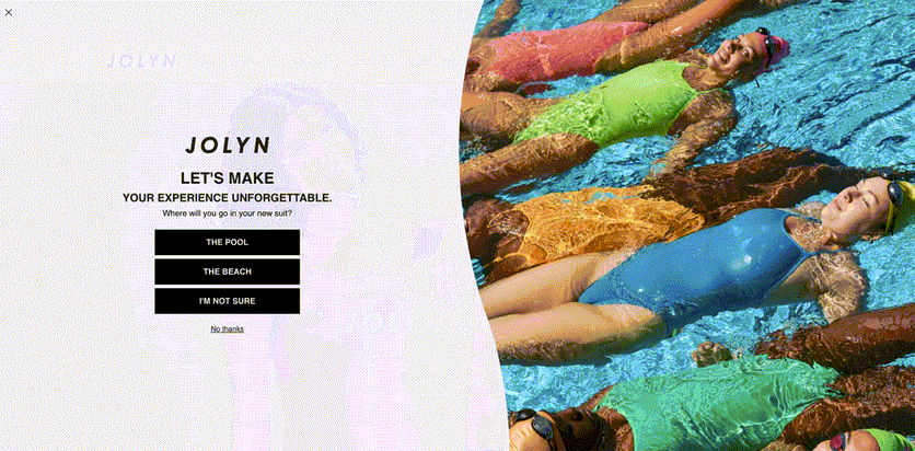
JOLYN's popup adjusts the offer in real time — higher discounts only when needed, preserving margins

Side-panel forms that don’t cover the content convert at lower rates but generate less friction. On desktop, they work equally well on the left or right. On mobile, the bottom-left corner is ideal — users can easily close it with their right thumb.
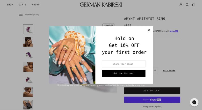
German Kabirski uses a “Recently Browsed” side widget that targets visitors who’ve viewed multiple jewelry pieces. It offers to save their browsing history via email — a useful, non-intrusive value exchange that converts at 1.45%.
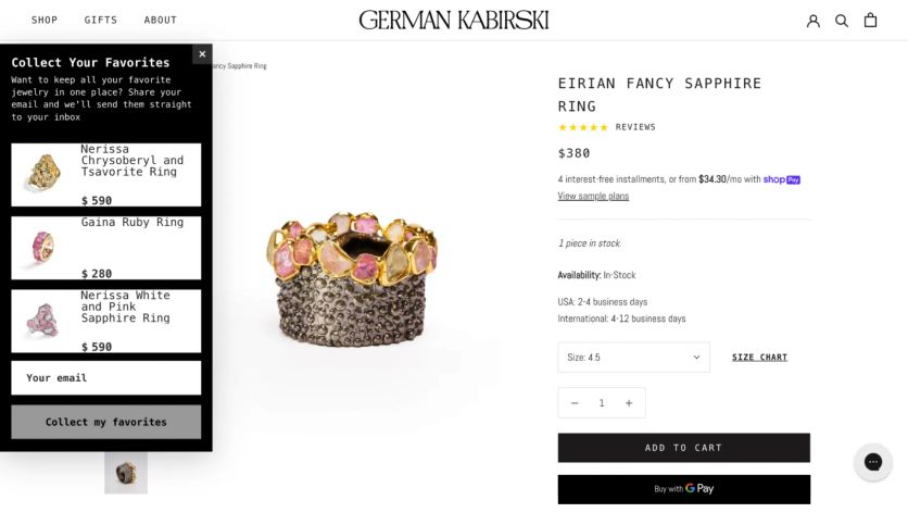
A side widget that offers to save the visitor's browsing history — useful and non-intrusive
Dedicated Landing Pages
Standalone pages built for one purpose — capturing signups. Traffic usually comes from social media or paid ads. Because visitors who click through have already shown intent, these pages tend to convert well.
This format works best for high-value lead magnets: early sale access, gated content, exclusive memberships. The key advantage over popups is focus — there’s nothing else on the page to distract from the signup.
The right format depends entirely on context. For content-driven sites, placing the form at the end of an article makes sense — the reader has already gotten value and is open to engaging further. In ecommerce, where paid traffic floods the site, popups that trigger after a set time or on exit intent work better — they’re a chance to present an offer before the visitor leaves. Product-picker quizzes work well on category pages, where customers often struggle to decide between too many options.
What Makes a Good Popup Design
Every effective form shares the same core elements. Here’s what each one should include — using Atlanta Cutlery’s lead capture popup as a reference.
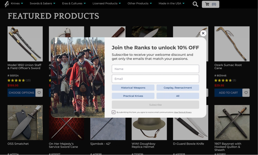
Atlanta Cutlery's popup collects email, phone, AND customer interests — segmenting subscribers before the first email is sent
Headline — carries the main offer or describes the bonus. It’s the first thing visitors read, so it needs to communicate value in under 10 words.
Body text — a short description of the offer. Keep it to 1–2 sentences. Explain what subscribers get and why it matters.
Input fields — their number depends on your goal. If you only need an email, one field is enough. If you want richer data, add fields for preferences, birthday, or phone number — but always explain why. When asking for a birthday, mention the gift you’ll send. When asking for a phone number, clarify what they’ll receive via SMS.
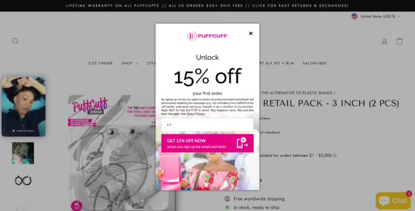
Multi-step forms are especially effective here. The first screen captures the email, and subsequent screens let visitors optionally fill in more details. If they’d rather not, they just click “skip.” The critical detail: save the email at step one, so you don’t lose the contact if the visitor drops off mid-form.
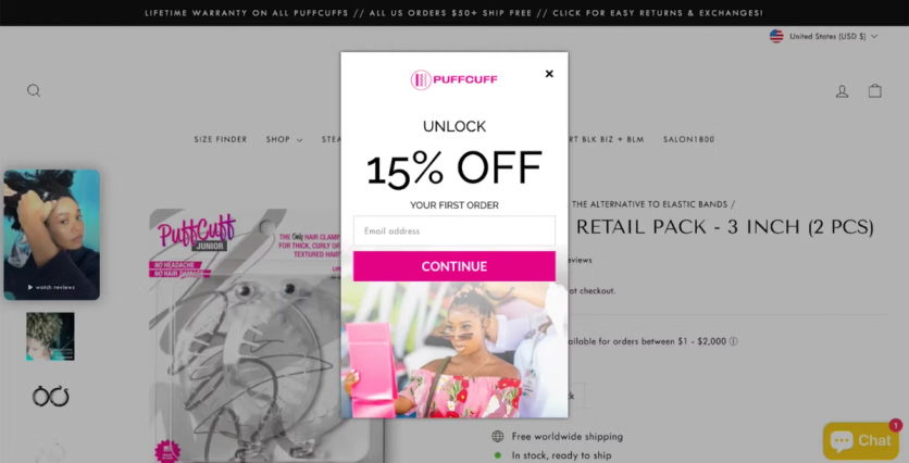
PuffCuff’s popup consists of two steps:
Submit button — once the visitor clicks, the next step should kick off immediately. An automated welcome sequence, a promo code delivery, or a personalized recommendation. The person just expressed interest — don’t let that momentum fade.
How Do I Set Up a Lead Generation Form on My Website
There are two paths: build it from scratch or use a form builder.
Coding manually requires HTML and CSS skills. It’s doable if you have developers, but every change — copy tweak, A/B test, new variant — requires their involvement again. Without a data management system, segmenting visitors and setting display rules through custom-built forms gets complex fast.
Form builders are the faster route. They come in two categories:
Standalone tools (like Wisepops, Privy, or OptinMonster) let you create and deploy popups on your website. They’re simple to set up and usually offer template libraries. The limitation: they collect data, but you still need to connect them to your ESP or CDP so the contact info flows into your database and powers campaigns. That integration step adds complexity.
All-in-one platforms (like Maestra) include the form builder as part of a broader CDP. The popup connects directly to your customer database — every email, phone number, and preference captured flows into unified customer profiles automatically. No integration needed, no data gaps. You can segment new subscribers, trigger welcome flows, and personalize website content based on the data collected — all from one platform.
Either way, the setup process is straightforward: add one line of JavaScript to your website (no developer needed after that), choose a template from the library, customize the design to match your brand, set your targeting conditions, and test. Most templates are fully customizable — colors, images, copy, layout — so they’ll match your site perfectly.
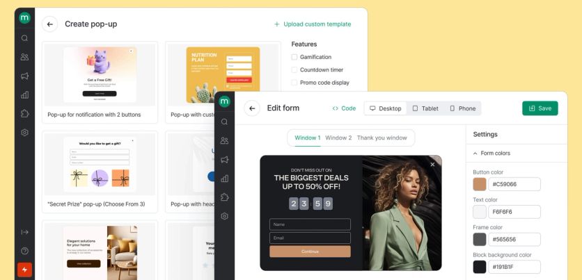
Maestra’s popup builder: choose a template, customize the design, set targeting rules — no coding required.
When Is the Best Time to Show a Website Popup
Timing depends on what the form is trying to achieve.
Collecting data or building a list? Let visitors browse first. Showing a form before they’ve had a chance to see your products feels premature.
Promoting a discount? Show it early — as soon as the visitor opens a product page. They’re already looking at something they might want; a discount could be the push they need.
Pre-sale or event signups? These work especially well before Black Friday, Cyber Monday, Memorial Day, or any major sale. Invite visitors to leave their email for early access — people hate missing out on a deal they would’ve loved.
The specific trigger conditions matter more than most brands realize. Blossom Flower Delivery fine-tuned their mobile popup timing through systematic A/B testing. Their control showed the popup after 30 seconds or 2 page visits (0.26% conversion). The winning variant: showing it after just 20 seconds — tripling conversion to 0.81%. That single timing change projects to +55,300 additional leads per year.

Additional timing tips that work in practice:
- Scroll depth triggers — show the popup after the visitor scrolls 50–60% of the page, indicating genuine interest
- Page count triggers — wait until the visitor has viewed 2–3 pages before interrupting
- Time-on-site triggers — 15–30 seconds works for most ecommerce sites; longer for content-heavy pages
- Combine conditions — the most effective triggers use multiple signals (time AND scroll depth AND page count)
What Is an Exit Intent Popup, and How Does It Work
An exit intent popup detects when a visitor is about to leave — typically by tracking cursor movement toward the browser’s close button or address bar — and displays one last offer before they go. It’s your last chance to capture a contact that would otherwise be lost.
Exit intent popups work because the visitor has nothing to lose. They were already leaving. A well-timed offer at that exact moment feels like a helpful reminder, not an interruption.
German Kabirski triggers an exit intent popup when new visitors attempt to leave, offering a discount in exchange for their email. Conversion rate: 0.85%. That might sound small, but across thousands of daily visitors, it adds up to a meaningful number of contacts that would have been lost entirely.
PuffCuff offers a 15% discount and asks visitors to subscribe to the newsletter. It converts at 1.47%.
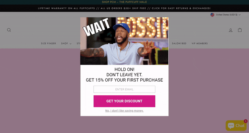
PuffCuff's exit intent popup converts at 1.47% by offering a personalized 15% discount
How Do I Layer Popups So They Don't Annoy Visitors
Even a great popup wears out. Over time, visitors get used to the same offer, the same design, the same timing — and conversion drops. That’s why the smartest brands use a layered approach: multiple form formats at different intensity levels, triggered by behavior.
First layer — the boldest: a center-screen popup with a strong offer, like a 10% discount or a gamified experience. This fires for first-time visitors who meet your targeting criteria. If they close it, the offer didn’t resonate — don’t show it again.
Second layer — lighter: a small sidebar widget or slide-in form that doesn’t block the content. This targets visitors who dismissed the first popup but are still browsing. The offer might be different — save your browsing history, get notified about a price drop, join a waitlist.
Third layer — minimal: an embedded element within the page itself. A subtle “join our email list” section in the footer or within content. This catches motivated visitors who actively look for a way to subscribe.
The logic behind each layer can be configured by behavior, segment, or visit frequency — so the interaction feels like helpful service, not repeated nagging.
Should I Personalize Forms for Different Visitor Segments
Showing the same popup to every visitor is leaving money on the table. A first-time visitor, a returning browser, and a loyal customer have completely different needs — and the form they see should reflect that.
Magnum Bikes, an e-bike brand that doubled online orders after switching from Klaviyo to Maestra, runs segment-specific popups based on visitor type. New visitors see promotional offers paired with a lead capture form. Returning customers see the same promotion without the signup prompt — just direct shop links.

The new visitor version — an email capture form with a bonus offer

The returning customer version — no signup prompt, just direct shop links

Do Gamified Lead Capture Forms Actually Convert Better
Yes — consistently. Simple interactive elements like mystery gift boxes, spin-to-win wheels, and product-picker quizzes outperform static “enter your email for 10% off” forms. People enjoy playing. It transforms the signup from a transaction into a micro-experience.
Gamified Popups
Blossom Flower Delivery replaced a standard discount popup with a mystery gift box. Visitors pick a box, enter their email to reveal their prize, and receive the bonus. Lead conversion rate: 6.72% — more than double the ecommerce average of 2–3%.
The mechanic works because it adds an element of surprise and delight. But the game alone doesn’t guarantee signups. What matters is the reward at the end. If the prize feels worthless, nobody will share their email. The mechanic converts when the visitor genuinely feels they received something valuable — a real discount, early access, or a personalized selection.
Product-Picker Quizzes
Quizzes work differently from gamified popups. Instead of a reward, they offer utility — helping the visitor find the right product. The visitor invests their time answering questions, gets useful recommendations, and the email ask feels like a natural next step (“enter your email and we’ll send the full selection”).
Blossom Flower Delivery increased website conversion by 14% with a product-picking quiz that helps visitors choose the right bouquet by asking about the occasion, recipient, and style preferences. Revenue per user rose 16%.
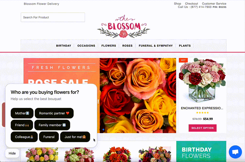
Blossom Flower's product quiz: a few questions about the occasion and recipient, then personalized bouquet recommendations
Survey-Style Forms
Survey forms sit between quizzes and gamification. The visitor answers a few questions about their preferences — style, size, use case — and in exchange gets personalized recommendations or access to curated content. They’re particularly effective for brands with complex or varied product lines where customers need guidance.
Furniture Fair, a family-owned furniture retailer with 250,000 subscribers and 13 locations, runs a Maestra-powered “Discover Your Signature Style” quiz on their website. The quiz asks five image-based questions — about personality, lifestyle, entertaining style, household type, and dream home — then matches visitors to one of five design profiles: Country Chic, Globally Inspired, Urban Mod, Luxe Living, or Enduring Elegance. After the style reveal, the quiz captures phone numbers with TCPA-compliant SMS opt-in — turning casual browsers into contactable leads with a clear style preference attached to their profile.
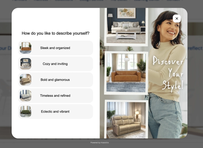
Furniture Fair's Maestra-powered design quiz profiles visitor style preferences and captures SMS opt-ins
What Should I A/B Test on My Lead Generation Forms
Everything. Design, copy, offer, timing, targeting rules — even the CTA button text can move the needle. “Get my discount” might convert better than “Subscribe,” or vice versa. You won’t know until you test.
Here’s what to prioritize:
1. The offer itself — discount vs. free shipping vs. early access vs. gamified reward. Enlightened Equipment found that a guaranteed 10% discount generated 187.8% more leads than a sweepstakes entry. 1Thrive boosted signups by 4.26% by changing their popup copy from “$20 off $149” to “exclusive deals with savings up to 50% off” — positioning email as the sole gateway to insider pricing.
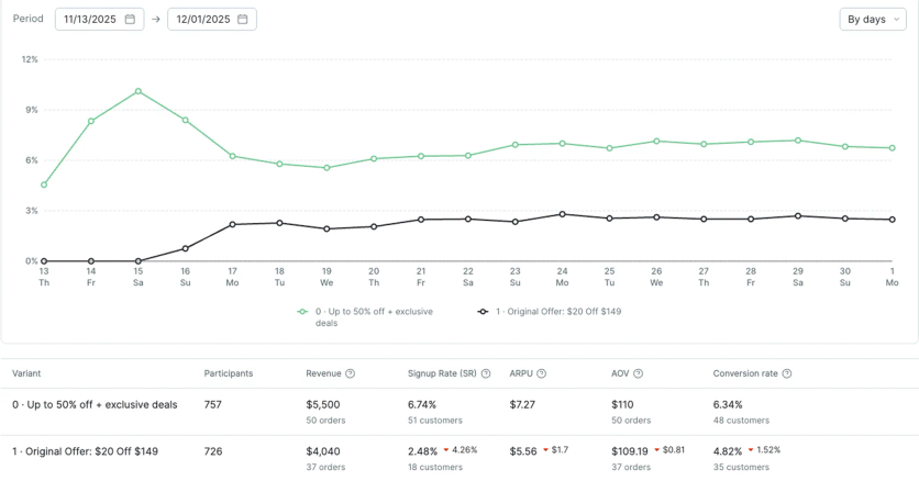
1Thrive's A/B test: “exclusive deals” messaging outperformed the “$20 off” offer

2. Timing — when the popup fires. Blossom Flower tripled mobile lead capture simply by changing the trigger from “30 seconds or 2 pages” to “20 seconds.”
3. Design and layout — image vs. no image, single-step vs. multi-step, center popup vs. slide-in.
4. Discount level — JOLYN uses AI to dynamically test whether 10%, 15%, or no discount converts best for each visitor profile.
Blossom Flower uses a structured A/B testing framework to prioritize experiments — scoring each hypothesis by potential impact, confidence, and ease of implementation.
The most important thing: test one variable at a time, run the experiment long enough to reach statistical significance, and measure impact across all key metrics — not just popup conversion, but also overall site conversion and revenue per visitor.
What Happens After Someone Fills Out the Form
The moment someone submits their email is the highest-intent point in the entire lead capture process. What happens next determines whether that lead becomes a customer or a dead row in your database.
Confirmation screen — thank the visitor, acknowledge their email, and explain exactly what’s coming next. If a discount was promised, show it immediately on screen. If a curated selection was offered, confirm it’s been sent.
Automated welcome sequence — should trigger instantly. Not in an hour, not the next morning — right now. The first email should deliver the promised value (discount code, content, product selection) and introduce the brand. Here’s how Blue Q does it:
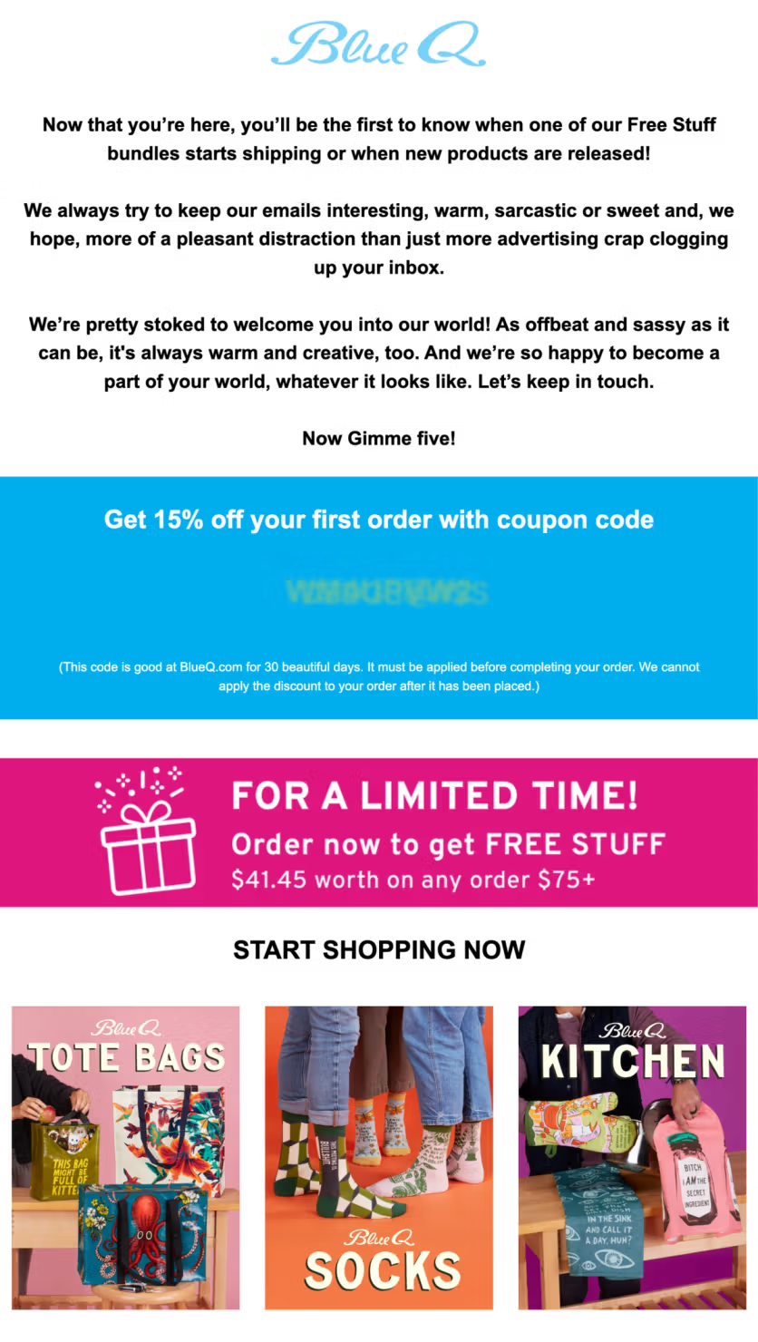
Blue Q's welcome email with coupon code — the promised discount delivered immediately
Track your performance continuously — monitor what share of visitors who see the form actually submit their data. If conversion drops, the form might need a refresh. Check your display settings too — misconfigured targeting can make your popup invisible even with heavy traffic. If conditions are too strict (like “90% scroll AND one hour on site”), practically no one will ever trigger it.
FAQ
- An effective lead generation form keeps the first ask small — ideally one field, email — and fires at the right moment to the right segment, not at every visitor the second they land. The incentive matters, but so does the value you promise: early access, subscriber-only sales, exclusive content. JOLYN uses AI to pick the right moment and the minimum incentive per visitor — some see 15%, some 10%, some none — and increased email capture 21% while protecting margins.
- The best examples come from real DTC brands. Blossom Flower Delivery doubled lead generation with a gamified spin-to-win form (6.72% conversion). German Kabirski layers welcome, exit-intent, and browse-history pop-ups. Enlightened Equipment lifted lead conversions 24.2% by testing a guaranteed discount against a sweepstakes. The 15+ examples above break down exactly how each one is built.
- It depends on intent. Exit-intent pop-ups recover leaving visitors, multi-step forms collect more data without scaring people off, gamified spin-to-win forms lift opt-in rates, and quizzes qualify leads while they engage. Most ecommerce brands run a mix and A/B test to find what converts for their audience.
- As few as possible for the first capture. One field (email) gets the highest conversion rate. If you need more data — phone, birthday, preferences — use a multi-step form that saves the email at step one. PuffCuff uses this two-step approach (email, then phone) to reduce friction. Everything beyond the initial email can be collected later through preference centers, quizzes, or follow-up emails.
- The average is 2–3%. Well-optimized lead generation forms consistently hit 5–6%. Exceptional cases go higher: Blossom Flower achieves 6.72% with a gamified format, Enlightened Equipment reaches 6.1% with a simple discount, and Blossom Flower's website personalization hits 9.81% on desktop with a $10 discount variant. If you're under 2%, the problem is almost always the offer, the timing, or the targeting — not the form design itself.
- Only if you plan to use SMS marketing — and only if you have the compliance infrastructure in place. In the US, TCPA requires explicit written consent for text marketing. A checkbox with clear opt-in language is mandatory. That said, SMS converts well for ecommerce. Maestra client, I Love Linen collects both email and phone through their product quiz, with 22.6% of starters providing both. The quiz format makes sharing a phone number feel natural because it's part of a larger interaction, not a standalone ask.
- Explain why you're asking and what they'll get. German Kabirski collects birthdays through a dedicated cross-channel flow: an email invites customers to share their birth date, the link opens a popup, and the customer enters only their birth month and day (no year required — a deliberate choice that lowers the barrier). The data flows automatically into the unified customer profile and triggers a birthday campaign.