16 Website Personalization Examples for Ecommerce — Beyond Product Recommendations

Recommendations are just one slice of website personalization. You can still adapt almost everything else a visitor sees — announcement bars, banners, product-page overlays, popups, shipping messages — based on who they are, where they came from, and what they’ve done.
So we collected on-site ecommerce personalization examples from Maestra clients — brands of different sizes, running on Shopify, BigCommerce, and WooCommerce. Here are 16 tactics, grouped by where they live on the site. Copy what fits.
Content:
- What Website Personalization Means
- Site-Wide Personalization Examples
- Catalog and Category Page Personalization Examples
- Product Page (PDP) Personalization Examples
- Minicart and Checkout Personalization Examples
What Website Personalization Means
Website personalization is the practice of adapting what each visitor sees — announcement bars, banners, product-page overlays, popups, shipping messages — based on who they are, where they came from, and what they’ve done before. For an ecommerce brand, it’s how a single storefront quietly becomes a different store for every shopper.
Let’s start with what every visitor sees:
Site-Wide Personalization Examples
Announcement bar — the highest-visibility personalization slot
An announcement bar is the highest-visibility slot on any site — every visitor sees it on every page. That makes it the default home for whichever message currently matters most: an active promo, a shipping rule, a brand highlight.
On Blue Q's website, the bar surfaces an active sale, and — if the promo is time-sensitive — a countdown timer that creates urgency.
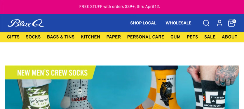
When no promo is running, the same slot can carry information that matters most to the current visitor — a free-shipping threshold, flat shipping cost to their region, a new collection, or a featured product category.
Sticky banners that follow the scroll
A sticky banner stays visible as the shopper scrolls, giving promotions reach beyond the homepage. It can be shown selectively — on specific pages, to specific audiences, or only until the visitor dismisses it. And it can be richer in content (imagery, CTA buttons) than an announcement bar.
For example, Sena's promos underperformed because sales were only featured on the homepage — but most customers landed elsewhere. Maestra launched sticky banners that stay visible wherever the visitor lands. Smart targeting keeps them relevant and non-intrusive — banners auto-hide during checkout to avoid purchase distractions, on sale pages where they’re redundant, and for visitors who already closed them.

Floating promo code bar — carry email discounts onto the site
A promo code buried in an inbox is easy to forget. A floating bar that follows the shopper across the site — carrying the exact code from the email they clicked — keeps the benefit in view the whole way, and confirms the discount they were promised is real.
German Kabirski's abandoned-cart and win-back emails each carry their own code. When the recipient lands on the site, a floating bar at the top displays that code, ready to copy.
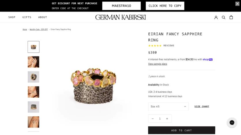
German Kabirski’s floating bar carries the promo code from email onto every page of the site
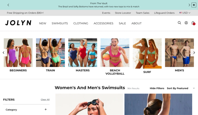
Loyalty point balance that follows shoppers everywhere
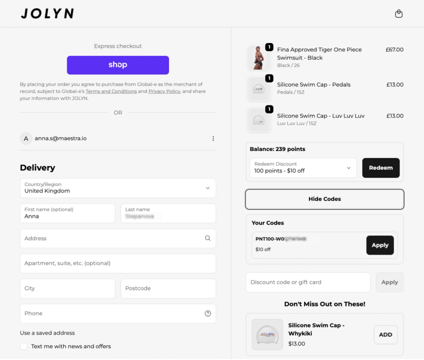
Loyalty programs only drive behavior if customers remember their points exist. Surfacing the point balance site-wide turns abstract points into a concrete discount at every step of the journey. JOLYN shows the balance on every page:
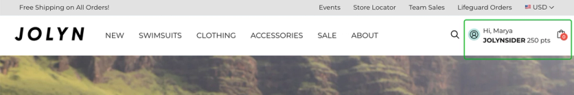
Point balance follows the customer across the site — visible in the header on every page
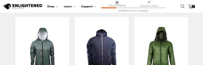
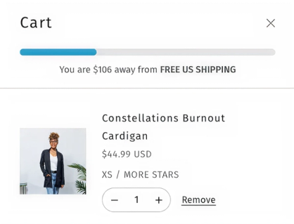
Upsell progress bar that lifts average order value
A visual progress bar toward a reward — free shipping, a gift, the next loyalty tier — is one of the most effective ways to lift average order value (AOV). It gamifies adding one more item by making the gap to the reward visible.
Enlightened Equipment runs a two-tier version — free shipping at the first threshold, a free gift at the second — and the bar recalculates in real time as items are added. In a 38-day A/B test: +38.7% AOV and +$99.8 revenue per order vs. control.
Blue Q takes the same mechanic further and adapts the bar to whatever promo is running — free shipping by default, countdowns or flash-sale reminders during active campaigns.
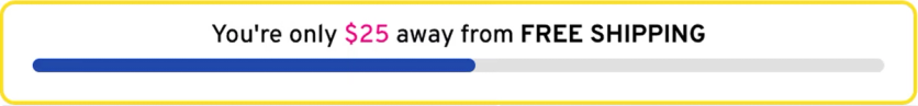
The evergreen upsell bar nudges shoppers toward free shipping
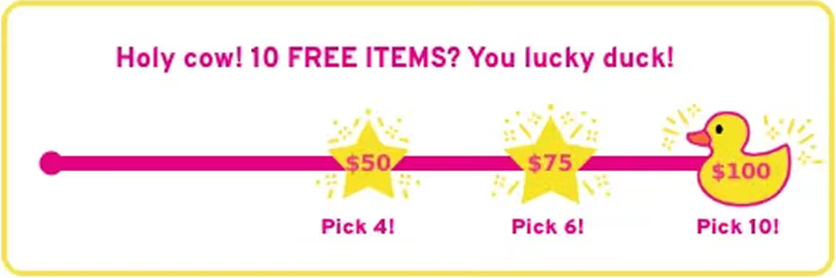
During Black Friday the upsell bar highlighted free items to maximize the impact of the promo
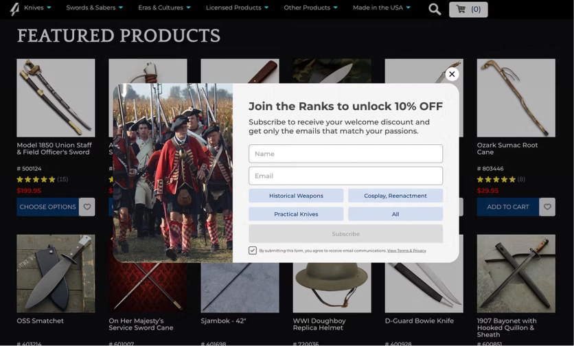
Multi-step popup that segments on signup
A generic email popup (“enter your email for 10% off”) gives you an email but no context. A multi-step popup that first asks about the visitor’s interests gives you segmentation data that feeds personalized welcome flows and targeted campaigns from day one.
Atlanta Cutlery sells historical weapons and replicas — but “sword collectors,” “armor enthusiasts,” and “outdoor gear” shoppers behave very differently. Visitors now pick their interests after providing email and phone. Result: 800 new contacts in the first month across both sites, each routed into a category-specific segment.
Bottom line: the slots every visitor passes through — bars, banners, popups, the cart nudge — are your highest-leverage personalization real estate. Match the message to who’s looking, and never let them sit static.
Catalog and Category Page Personalization Examples
Shortcut filter buttons that show what’s right for you
Even with a small catalog, shoppers still need help finding the right product quickly. Shortcut buttons at the top of a collection give shoppers a one-tap way into the most relevant subset — and they can be cut by any attribute that matters: size, price, material, or use-case scenarios like “computer for gaming” vs. “computer for work.”
Svaha USA's shoppers frequently complained it was hard to tell which items were in stock in their size. Maestra injected shortcut buttons above the grid — one click and only in-stock sizes remain.

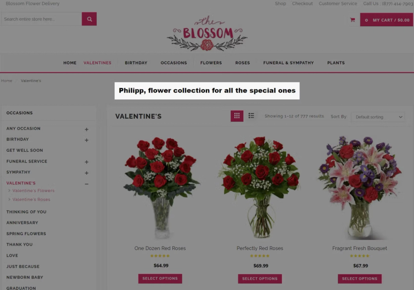
Personalized catalog headlines for returning visitors
For returning customers, generic catalog copy is a missed chance. Addressing the shopper by name is a small touch that signals a one-to-one relationship, even on a category page built for everyone. Blossom Flower identifies returning visitors and injects their first name into catalog headlines and copy.
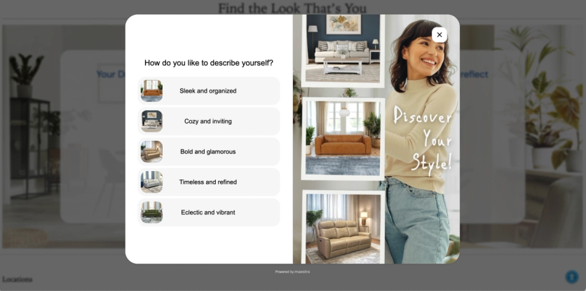
Product-picking quiz — personalization with zero-party data
A narrow catalog can feel narrower than it is — even 40 SKUs means 40 decisions. A short quiz — two or three questions about use case, style, or budget — collapses that into a handful of pre-qualified recommendations. As a bonus, it collects zero-party data that feeds segmented follow-up campaigns.
Furniture Fair asks shoppers a few questions about their style to offer relevant furniture pieces, or to connect them with an in-house designer — someone who helps pick products and plan the room around them.
Bottom line: A handful of personal touches — the right products up front, the shopper’s name, a quick quiz — make each visitor feel looked after instead of processed.
Product Page (PDP) Personalization Examples
Trust signals stacked next to the Add to Cart button
Trust signals — free shipping threshold, return policy, brand values — are usually scattered across the site: in the header, footer, FAQ. Most shoppers never see them at the moment they decide to buy. Consolidating them next to the Add to Cart button gives visitors every reason to commit in one place.
Blue Q stacks free shipping threshold, 30-day returns, and brand values directly under the ATC button:
Blue Q stacks shipping, returns, and brand values under the Add to Cart button
First-order offer for new customers only
First-time buyers need more convincing than repeat customers — they haven’t experienced the brand yet, so small friction points can kill the purchase. Layering an extra perk just for them — an exclusive discount, a money-back guarantee, free returns — builds trust faster without diluting the PDP for everyone else. Showing the same message to existing customers wastes prime real estate.
Svaha USA offers a free 30-day return on the first purchase. Below the Add to Cart button, a dynamic line appears only for non-purchasers, keeping the PDP clean for repeat customers.
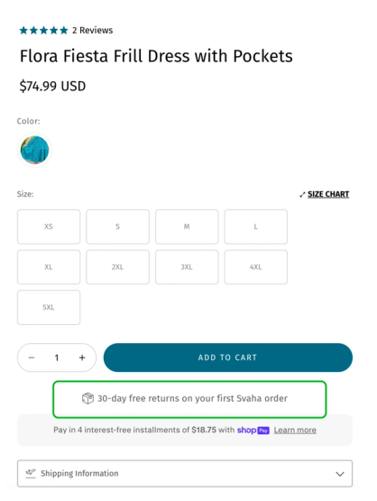
Free 30-day returns message injected under the Add to Cart button for new customers only
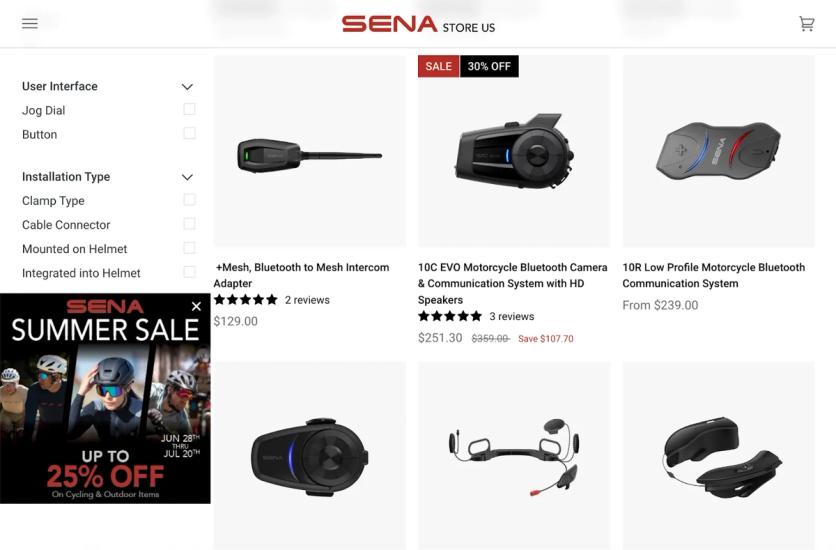
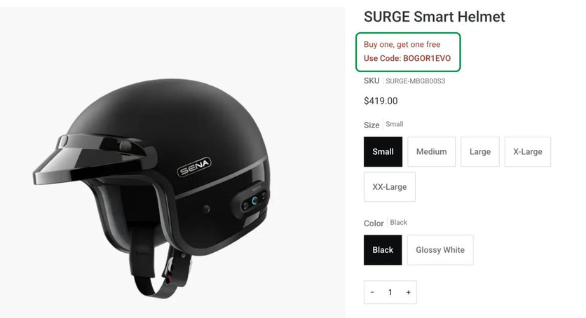
Promo overlays that match the deal to the product
Sticky banners pull visitors toward sale pages — but on the PDP itself, shoppers need to see how the active promotion applies to the exact product they’re viewing. Embedded promo overlays do that: original and sale prices, discount percentage, total savings, and a promo code if one applies.
Sena uses fully customizable PDP overlays. The Memorial Day Sale overlay, for example, surfaced original and sale prices, discount percentage, and total savings:
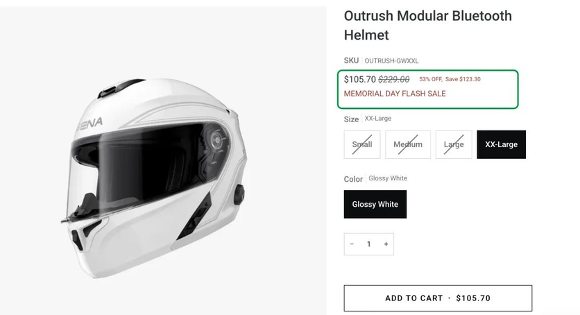
If a promotion includes a code, Maestra displays it right on the product page.
Svaha USA applies the same logic as a promo reminder badge: it creates urgency for timed flash sales while flagging eligibility item-by-item. Before Maestra, customers only learned about exclusions at checkout — and complained.
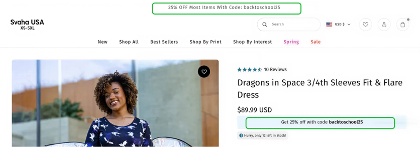
Geo-targeted and referrer-based PDP messaging
A single sitewide promo banner doesn’t always fit everyone. Australian and US shoppers run on different retail calendars; a visitor arriving from a specific ad expects to see that offer. PDP and announcement-bar messaging that adapts to geolocation or referrer matches the expectation the visitor arrived with.
Two examples from Svaha USA's playbook. Back-to-school hits Australia and the US in different months. When AUS visitors land on the site during their season, the announcement bar and PDPs swap the US-only offer for a 25% off back-to-school promo tied to their calendar.
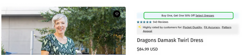
Svaha USA also runs an evergreen "Buy One, Get One 50%" ad on a rotating set of dresses. Visitors who click through from that ad see the BOGO badge on every qualifying dress, plus a link to the full collection. Everyone else sees a clean PDP — the offer stays tied to the ad that brought them in.
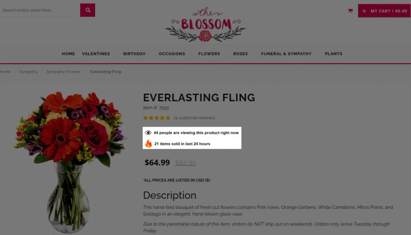
Real-time social proof on product cards
Shoppers decide faster when they see others looking at or buying the same thing. Real-time counters on product cards — “12 people viewing now,” “34 sold in the last 24 hours” — turn quiet catalog pages into signals of demand. Especially useful for narrow catalogs, where the brand can’t lean on a long tail of bestsellers.
Blossom Flower tested this across 50,000 sessions over 15 days: +34% median uplift on product cards carrying the overlay vs. those without.
Bottom line: the product page is where the decision happens. Put the right reassurance, the right offer, and the right proof in front of the right shopper — and nowhere else.
Minicart and Checkout Personalization Examples
Country-aware shipping in the minicart
The minicart is the last place a shopper sees before checkout, and confusion about shipping costs is one of the top reasons for abandonment. Instead of showing the same message to everyone, the minicart can surface the rule that actually applies to the visitor's country. Svaha USA replaces the generic "free shipping over $150" with a country-aware message:
US shoppers see the free-shipping progress bar
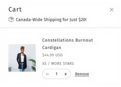
Canadian shoppers see the $20 flat rate
One checkout widget that auto-applies every code
A shopper can have multiple active promo codes at once — loyalty reward, birthday promo, win-back, abandoned-cart discount. Making them hunt through inboxes or copy codes manually kills momentum. A unified widget that surfaces and auto-applies all available codes removes the last bit of friction before checkout. JOLYN's checkout widget shows the loyalty code (auto-applied) alongside every other promo the customer has earned. Marketing codes stack with loyalty rewards; two loyalty codes on a single order are blocked. Shoppers see their point balance without logging in.
Bottom line: the last screen before checkout is where doubt creeps in — answer the shipping question and apply every earned discount before the shopper has to ask.
FAQ
- Website personalization means adapting what each visitor sees based on signals like country, traffic source, purchase history, loyalty status, or current cart contents. Instead of every visitor seeing the same homepage, product page, or shipping message, each person sees the version most likely to help them convert. Svaha USA, a clothing brand, built this kind of experience end-to-end — shortcut filters by size, first-order return offers, BOGO badges tied to ad traffic, and country-aware shipping messages. Since building it out, Svaha has grown total sales +26% and AOV +14%.
- Personalized announcement bars that surface different messages based on visitor location or loyalty status
- Sticky banners that carry promotions across every page — Sena reached 58,000 visitors with one banner and outperformed two email campaigns combined
- Promo overlays on product pages that show real-time pricing for the active campaign
- Zero-party data quizzes that match visitors to the right products
- Country-aware shipping messages in the minicart
- Real-time social proof counters — Blossom Flower added overlays and saw a +34% median conversion uplift across 50,000 sessions
- Three measurable outcomes: higher conversion rate (visitors see active promotions and trust signals right when they're deciding to buy), higher AOV (upsell progress bars and promo overlays push order value up), and lower cart abandonment (country-aware shipping messages and surfaced promo codes remove checkout friction). There's also a softer benefit — visitors who feel the site "gets them" return more often. Enlightened Equipment runs a two-tier upsell progress bar that recalculates as shoppers add items; in a 38-day A/B test, it delivered +38.7% AOV and +$99.8 revenue per order vs. control. Blossom Flower added real-time social proof overlays on product cards and saw +34% median conversion uplift across 50,000 sessions.
- It works especially well. Product recommendations hit a ceiling quickly with 40 SKUs — there are only so many "you might also like" variations before you start repeating. Small-catalog brands get more value from personalizing around the product: geo-targeted announcement bars, first-order reassurance under the Add to Cart button, PDP promo overlays tied to active campaigns, and zero-party-data quizzes. Maestra supports all of these natively — each one can be launched and A/B tested without a developer.
- Under the hood, personalization needs three things: visitor data (behavior, purchases, email engagement, location), a rules engine that decides what to show based on that data, and a delivery mechanism that injects the content into the page in real time. The data usually lives in a CDP, which means personalization works best when the CDP and the personalization engine share the same platform. Maestra runs all three from one place — the CDP captures the signals, rules target content to specific segments, and the on-site engine updates banners, overlays, popups, and recommendations in real time as the visitor browses.
- Run every personalized element against a control group and measure revenue impact, not just clicks. The metrics that matter most: conversion rate on personalized vs. non-personalized experiences, AOV lift, revenue per visitor, and incremental revenue attributed to each tactic. Clicks and engagement rates are useful for diagnosing — if no one clicks the banner, the problem is the creative — but they don't tell you whether personalization moved money. A good personalization platform includes A/B testing against control groups as part of the core product, so you can measure each element independently. Enlightened Equipment measured their upsell progress bar over 38 days against a control group — that's how they confirmed the +38.7% AOV lift was real, not seasonal.