How to Build Ecommerce Email Templates

An ecommerce email template is a pre-built structure of reusable blocks (header, hero image, content area, product grid, CTAs, and footer) that you customize for each send instead of designing from scratch. The right template cuts production time from days to hours and keeps every email on-brand, regardless of who builds it.
The structure of your email directly affects whether people click, buy, or scroll past. Most brands nail the visual side and miss the selling structure: there's no clear path from opening the email to adding something to a cart. Below is a practical guide to building templates that look good and actually convert.
Content:
What Is an Email Template and Why It Matters
Pull up any ecommerce email that's actually working and you'll see the same skeleton: header, hero banner, content sections, product cards, CTAs, footer. The template is that skeleton, codified. Once it exists, every new send is swapping text and images on top of the same structure — not rebuilding it.
When every email looks different, subscribers spend a few seconds figuring out who's writing and why before they even get to the content. A consistent template creates recognition: readers know where to look for the offer, the products, and the action button.
Building an email from scratch (copywriter, designer, developer, QA) takes one to two weeks. With a template, the same email takes a day or less. Instead of designing each email as a single unit, you maintain a library of blocks and assemble each campaign from the pieces you need. Swap a product grid for a content block, add a timer for a flash sale, drop the upsell bar for a transactional email.
This approach solves two problems at once. First, any team member can build an email, not just the designer. Second, every email stays on-brand automatically because the blocks are pre-designed and pre-coded.
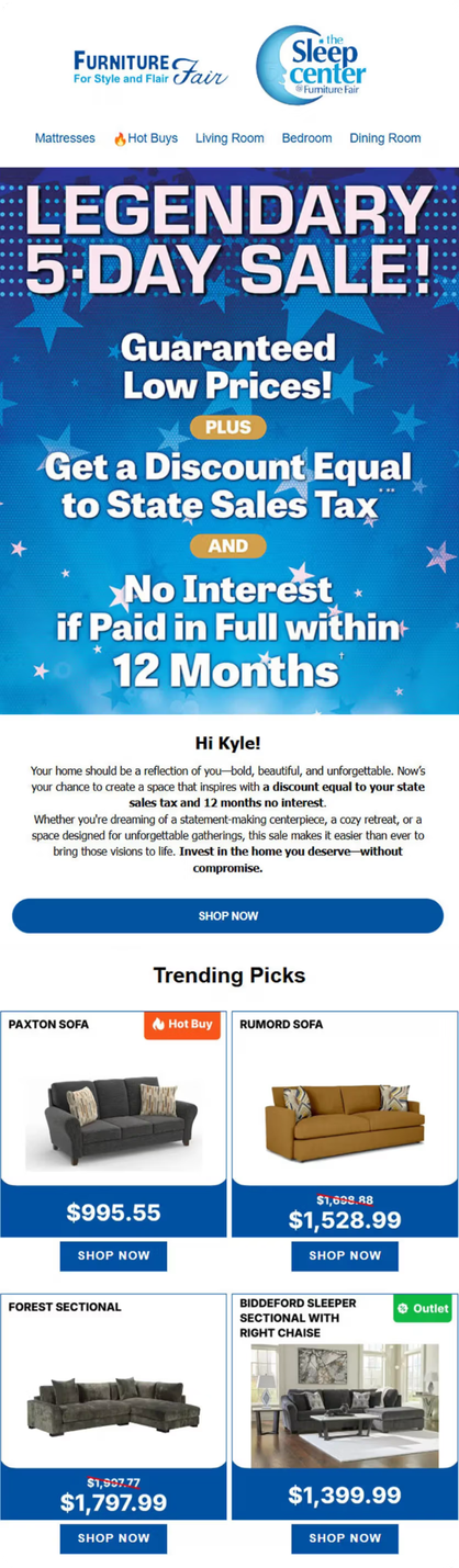
Furniture Fair, a furniture retailer with 250,000 subscribers, rebuilt their email channel through a full template redesign. The team designed five new branded templates, one for each department, so subscribers could instantly recognize which part of the business was emailing them. Each template shares the same structural framework but uses department-specific colors, imagery, and product layouts. When it's time to send a campaign, the team picks the right template and swaps in the current products and copy.
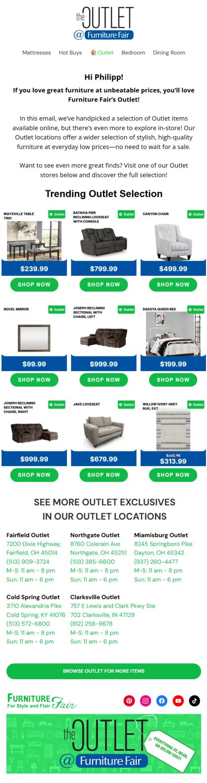
Furniture Fair's templates — department-specific branding and clear structure with engaging layout
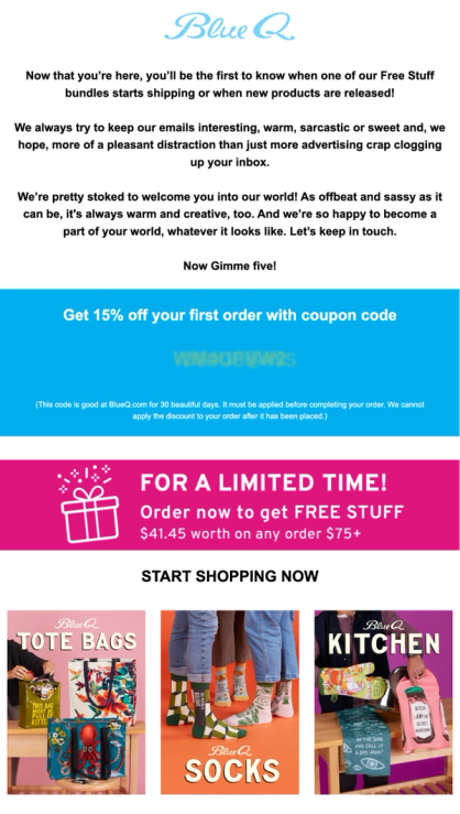
Blue Q, a consumer goods brand with 300K contacts, rebuilt their emails around conversion-focused content blocks. The result: +39% email-driven sales and +15% email-driven orders.
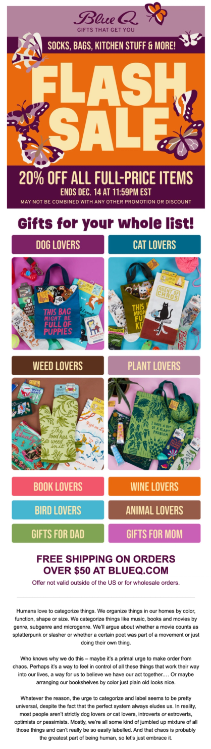
Blue Q's flash sale email with category navigation and free shipping offer
Maestra’s team built the modular blocks, keeping the brand’s design. The blocks let Blue Q assemble campaigns quickly and drive conversions. They include:
- Unique Selling Proposition bars (e.g., free shipping, 30-day returns, USA-based)
- Category navigation
- Countdown timers for flash sales and promo deadlines
- Product recommendations with images, add-to-cart buttons, and dynamic prices highlighting sales
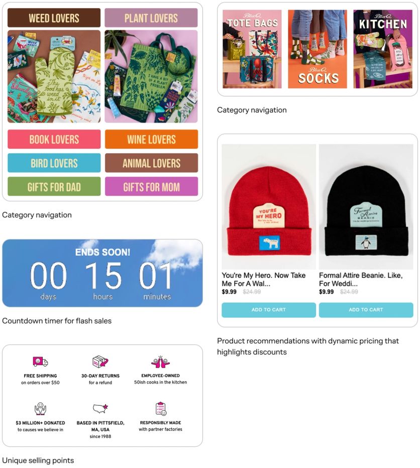
Blue Q's upsell bars, category blocks, recommendations, and add-to-cart buttons together create a clear purchase path
Across Maestra's clients, the biggest email revenue gains come from fixing the template structure rather than from writing better copy. Brands that invest a week in building proper modular templates recover that time within the first month, and keep getting time back with every send.
What Makes Up an Effective Email Layout
Every high-performing ecommerce email shares the same core building blocks. The order and emphasis vary by campaign type, but these elements form the foundation of any template.
Header
The top section above the main content. It anchors every email to your brand. Even subscribers who don't read the full email will see the header, so it needs to communicate who's writing, fast. Most brands include their logo, a navigation menu linking to key categories, and sometimes a phone number or helper links.

Enlightened Equipment's email header — a logo plus a navigation menu that lets subscribers jump straight to a catalog category
Hero Banner
The first visual element below the header. Its job is to grab attention and communicate the email's purpose at a glance. For a seasonal sale, that means the discount front and center. For a product launch, a lifestyle image with the new item. Keep text on the banner to a minimum — if someone needs to squint, they'll scroll past. I Love Linen’s hero banners follow this rule precisely — the sale name, the discount amount, and a shop button.
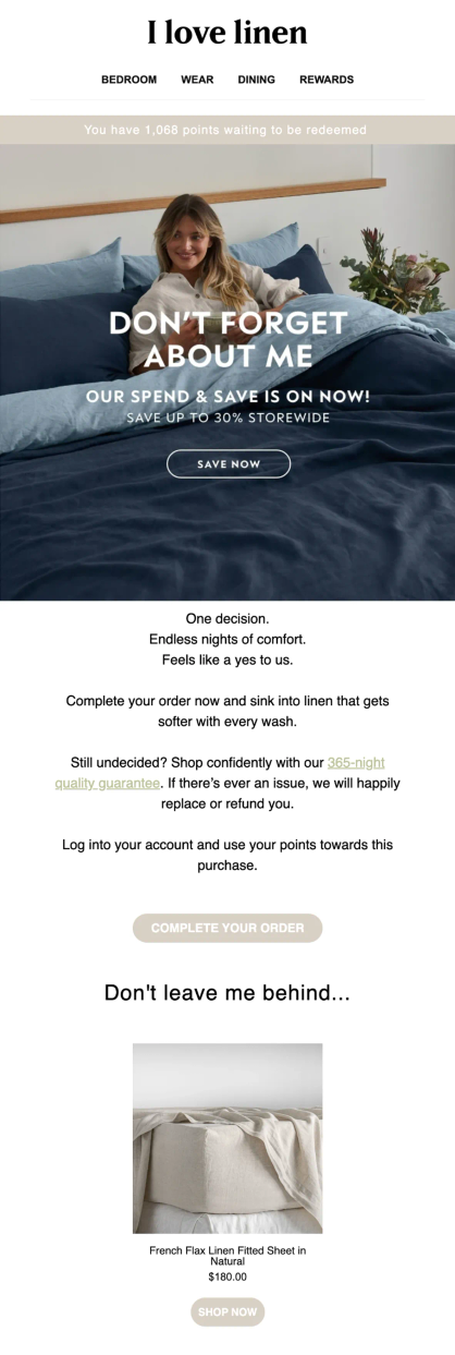
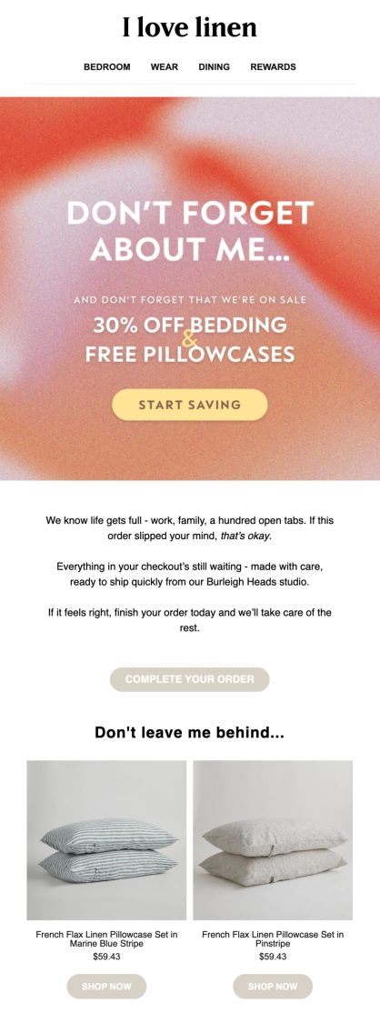
Two I Love Linen sends with the same hero formula applied to different sales
Content Block
Short, scannable text that delivers the core message. Effective content blocks rarely exceed a few sentences. If the message is long, lead with the most important information, because most readers won't make it to the second paragraph. Link every claim to a specific product or action.
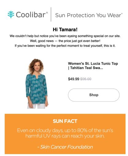
Coolibar’s Price Drop Alert is a clean example of this rule — the content block stays to a personalized greeting and a few short sentences. The product card and shop button come right after.
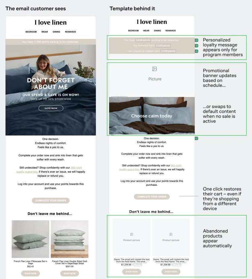
I Love Linen uses dynamic blocks that adapt content and product cards in real time for each recipient — displaying loyalty points only to members, recommending products based on order history, and personalizing any element using customer data.
Product Grid
Product cards arranged in a grid, typically two per row so they display well on both desktop and mobile. Each card includes an image, product name, price, and an add-to-cart or "shop now" button.
Dynamic product grids are even more powerful: they pull personalized recommendations based on each subscriber's browsing or purchase history, and can keep refreshing after the email is sent. Furniture Fair’s product visuals do exactly that — prices, "Hot Buy" tags, everything stays current, no matter when customers open the message.
Furniture Fair's email with product grid updating in real time

CTA Buttons
Clear, action-oriented buttons that tell the reader exactly what to do next. Keep the text to two or three words: "Shop Now," "See the Collection," "Grab Yours." Place CTAs both in the hero section and after the product grid. The more natural stopping points you offer, the more chances you give readers to click.
Magnum Bikes shows the rule in action: "Get Directions" on a store opening invite, and "Shop All Outlet Bikes" appearing twice in their Outlet promo — once after the product grid, once after the supporting content block — so readers always have a place to click.
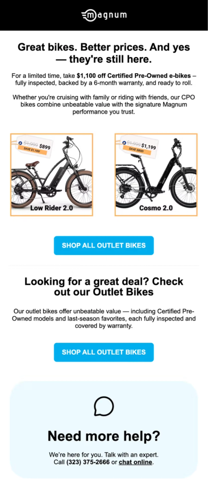
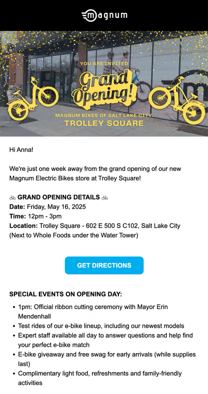
Magnum Bikes' Outlet promo and New store opening invite
Footer
The bottom of the email — contact information, social media links, unsubscribe link, and a web version link. The unsubscribe link isn't optional. It's legally required, and hiding it causes more problems than it prevents (subscribers who can't find the unsubscribe button mark your email as spam instead).
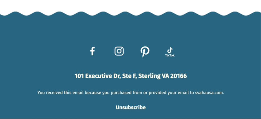
Svaha USA’s email footer
Two compliance details that often slip through US/CA template reviews:
- CAN-SPAM (US) requires every commercial email to include a valid physical postal address (street address, USPS-registered P.O. box, or registered CMRA mailbox per 16 CFR § 316.2) and a clear opt-out mechanism. See the FTC compliance guide.
- CASL (Canada) is stricter — it requires consent before sending, sender identification with a valid mailing address (valid 60 days), and a working unsubscribe processed within 10 business days. See the CRTC FAQ.
Most ESPs auto-insert the legally required fields (physical mailing address, unsubscribe link). Check that they still appear after platform migrations or template overhauls — they get silently dropped sometimes.
How to Create an Email Template — Builder, HTML, or Freelancer
There are three paths to building an email template. Each makes sense in different situations.
Drag-and-Drop Builders
Most email platforms include a visual builder where you assemble emails from pre-built blocks, no coding required. You pick a layout, drag in content blocks, customize colors and fonts, add images, and publish. This is the fastest path for teams without dedicated developers. All-in-one platforms like Maestra include the email builder as part of a broader CDP, so every element in your template can pull dynamic data directly from unified customer profiles. Product recommendations, promo codes, loyalty points, even real-time pricing get populated automatically without manual data wrangling.
Maestra's visual email builder
HTML and CSS
For full creative control, you can code a template in HTML and CSS from scratch. This gives you pixel-perfect control over every element, but requires developers for every change, from copy tweaks to A/B test variants. Email HTML is also notoriously quirky: different email clients (Gmail, Outlook, Apple Mail) render the same code differently, and modern CSS features often don't work.
If you go this route, test the template in multiple email clients before sending. Different clients (Gmail, Outlook, Apple Mail) render the same HTML differently, so a rendering-preview tool plus a few real test sends is the safe minimum.
Hiring a Designer or Agency
If you don't have an in-house designer, a freelancer or an agency can create a custom template set. They'll design in Figma or Photoshop, then hand off to a developer for HTML coding, or build directly in your platform's visual editor. The advantage is professional design quality. The disadvantage is turnaround time and ongoing costs for every update.
Most brands end up with a hybrid approach: a professional designs the initial template system, and the marketing team handles day-to-day assembly using the platform's drag-and-drop builder.
With Maestra, this work doesn't need a separate hire — your Forward Deployed Marketer does it for you. They work hands-on with brand teams to identify which elements can become reusable selling blocks, and then helps assemble templates around that structure, so the team can react to something concrete instead of debating in the abstract. This gets templates live in days instead of weeks.
Atlanta Cutlery, a US collectibles brand, has every template built to brand spec by their Maestra marketer Alexandra.
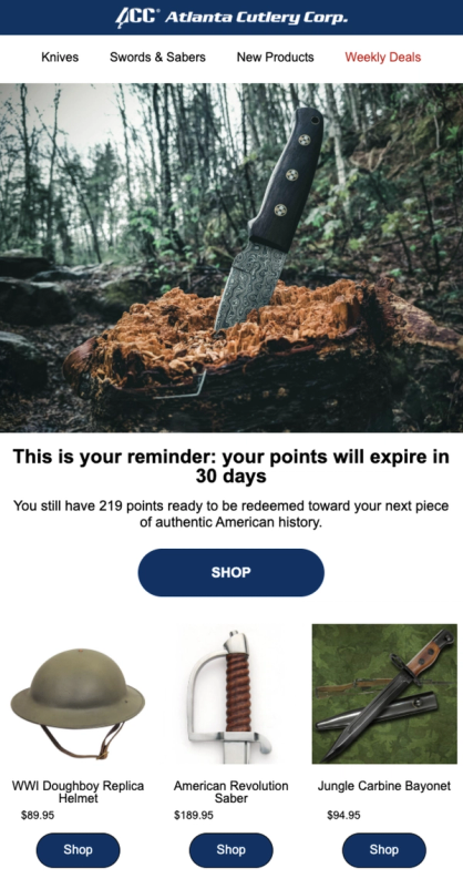
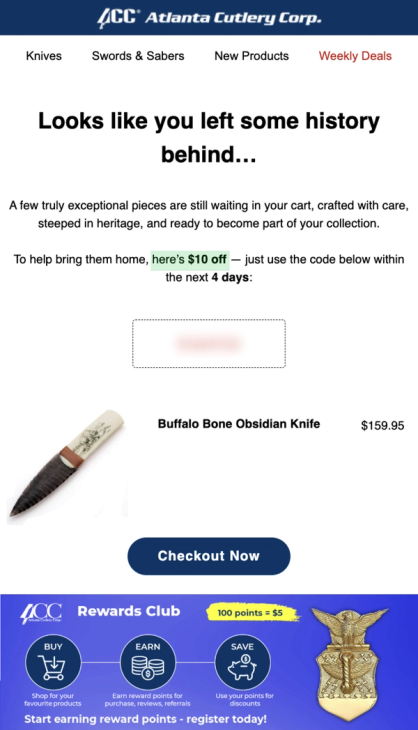
Atlanta Cutlery's points expiry reminder and abandoned cart email with incentives tailored to cart value
What Makes a Good Email Design for Different Campaign Types
Different emails serve different goals, and the template should reflect that. Here's what works for each major campaign type, with real examples.
Welcome Emails
Welcome emails get the highest open rates of any campaign type — often above 60% (Mailmodo). The template has one job: deliver the promised incentive (discount code, freebie), establish the brand, and set what's coming next. For most subscribers, this is the most attention you'll ever get from them — don't waste it on a polite hello.
A strong welcome template includes: a clear header with brand identity, the promised incentive prominently displayed, a few key product categories or bestsellers, and a CTA to start shopping.
Blue Q expanded their welcome series from a single email to a multi-step sequence: the first email delivers a single-use promo code with category navigation, and the second features personalized product recommendations based on early browsing behavior.
Blue Q's welcome email — a single-use promo code, category navigation, and a clear path to purchase
Abandoned Cart and Checkout Emails
About 70% of online carts get abandoned (Baymard Institute). Better checkout UX recovers some of that — but recovery emails are where the real chunk of revenue actually comes back, especially for higher-AOV categories where customers genuinely intended to buy.
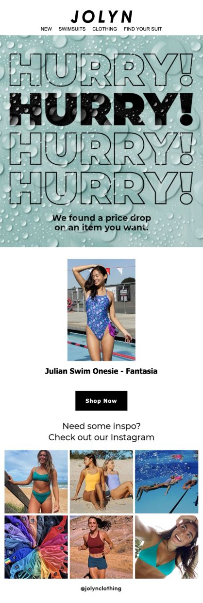
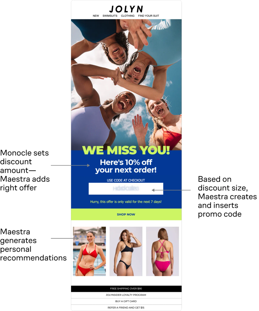
An effective abandoned cart template shows the exact items left behind (with images and prices), a clear "Complete Your Order" CTA, and optionally a bonus incentive. JOLYN, a swimwear brand with 1 million subscribers, shows customers everything they looked at, plus personalized recommendations for similar items. Clicking any product takes them to a pre-filled cart, even on a different device.
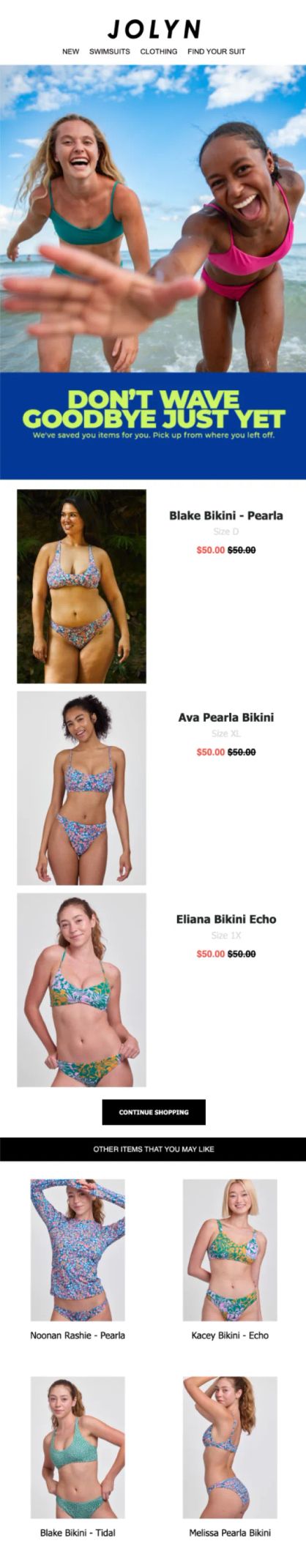
JOLYN's abandoned checkout email — all viewed products, plus AI-powered recommendations
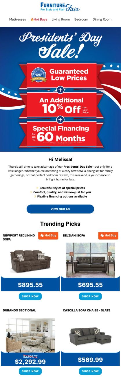
Promotional and Sale Emails
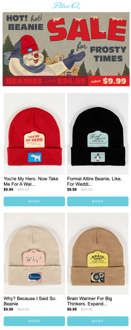
Campaign emails that promote specific products, seasonal sales, or limited-time offers. The template needs to lead with the offer (discount, deadline, exclusivity) and make the products immediately shoppable. Blue Q uses a countdown timer running to the sale deadline and offers free shipping for their flash sale.
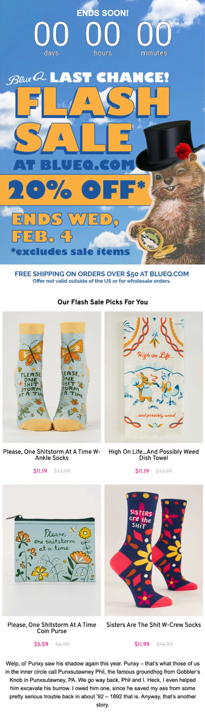
Blue Q's flash sale email with a countdown timer, product recommendations, and free shipping bar
Sena’s sales reminders include countdown timers and product recommendations.
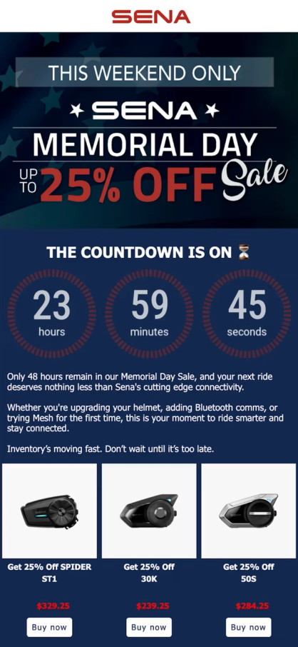
Sena's Memorial Day Sale email with a countdown timer and product recommendations
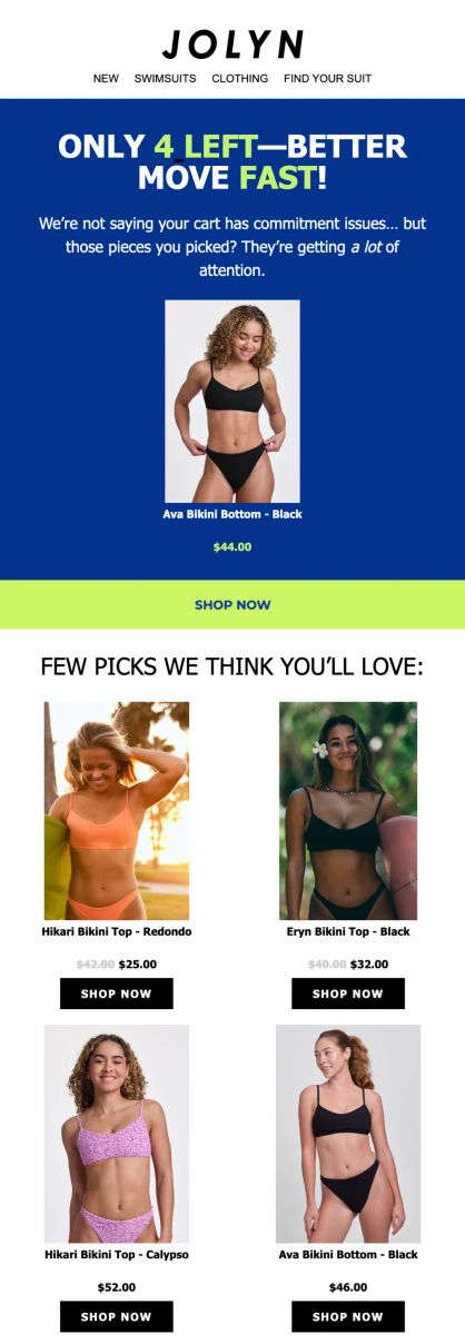
Price Drop and Low Stock Alerts
Automated emails triggered by inventory or pricing changes. These templates are short and urgent: the product image, the new price (or stock count), and a single CTA.
JOLYN's Price Drop and Low Stock Notifications
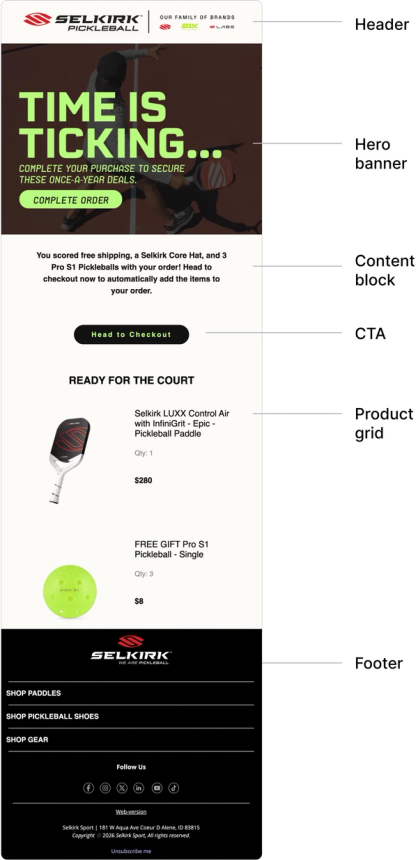
Back-in-Stock Emails
Automated emails triggered when a previously sold-out product returns to inventory. Subscribers opt in via a "Notify me" form on the product page, and the flow fires as soon as stock comes back. Templates are short by design: product image, restored availability message, and a single CTA that links back to the PDP.
Back-in-stock emails routinely outperform standard promotional sends because intent is already proven — the subscriber explicitly asked to hear about this product. For DTC brands with limited inventory or seasonal drops, this is one of the highest-converting flows in the playbook.
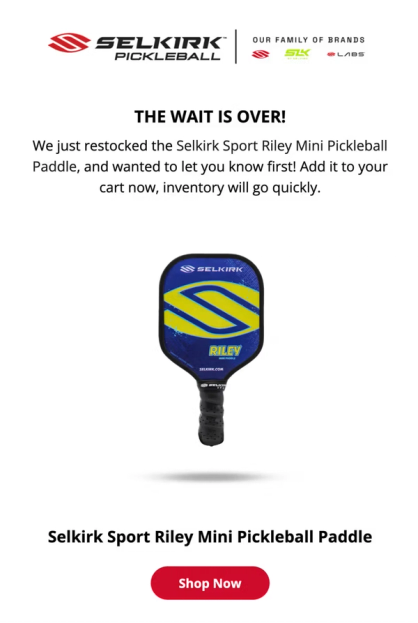
Selkirk Sport’s Back in Stock email
Post-Purchase Emails
The flow that fires after a customer buys. Most brands stop at the order confirmation, but the strongest DTC programs run a full post-purchase sequence: shipping notifications, a "how to use" or styling guide, a review request, and a cross-sell or replenishment prompt.
Each step has a distinct template. Transactional confirmations and shipping notifications are minimal — order details, tracking link, and brand identity. Review requests time the ask to delivery plus a few days, so the package has arrived. Cross-sell and replenishment templates mirror your promotional layout but populate with products related to what the customer just bought.
For consumable categories (supplements, cleaning, beauty), replenishment templates are timed to the product's usage cycle. A 30-day supply triggers a refill reminder around day 25.
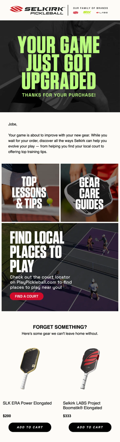
Selkirk Sport’s Post-Purchase email with cross-sell recommendations
Reactivation Emails
Subscribers go quiet for all sorts of reasons. Reactivation emails are how you sort the ones who are genuinely done from the ones who just got busy. Keep them short and give a real reason to come back — usually a promo code or a glance at what they've missed.
JOLYN's AI-powered winback flow, built with Maestra and Monocle AI, goes further. Instead of sending the same offer to everyone, the AI determines the ideal timing and discount level for each individual customer. The result: 9x higher winback conversion and +15% AOV compared to their previous approach.
Technical Best Practices for Email Template Design
A well-designed template still has to render correctly across clients and load fast in the inbox. A few technical guardrails decide whether subscribers actually see what you built.
Watch Your Email File Size
Gmail clips emails that exceed 102KB, cutting off everything below the fold, including your footer and unsubscribe link. When subscribers can't find the unsubscribe button, they mark the email as spam instead. That hurts your sender reputation and makes deliverability worse over time.
4ocean, an ocean conservation brand with 250 employees, ran into exactly this problem. Emails built on their previous platform (Klaviyo) kept getting clipped by Gmail. After switching to Maestra, their dedicated Forward Deployed Marketer rebuilt all templates using Maestra's email editor, which optimizes HTML code automatically. The result: 30% reduction in email file size, no more clipping, faster load times, and better deliverability.
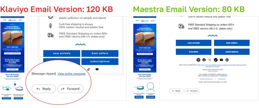
4ocean's email file size dropped 30% after rebuilding templates in Maestra's editor — eliminating Gmail clipping entirely
Design for Mobile First
Roughly half of all emails are opened on mobile devices (Litmus). Templates that look great on desktop but break on a phone lose the majority of their audience. Key mobile considerations: single-column layouts, touch-friendly button sizes (minimum 44x44 pixels, per Apple Human Interface Guidelines), readable font sizes (16px minimum for body text), and images that scale proportionally.
Test Across Email Clients
The same HTML renders differently in Gmail, Outlook, Apple Mail, and Yahoo. What looks perfect in one client might display broken images, misaligned columns, or invisible text in another. Send test emails to accounts across all major clients before every campaign, or use rendering tools to preview automatically.
How to A/B Test Your Email Template Design
Templates should evolve based on data, not assumptions. A/B testing lets you compare two versions of the same email and measure which one performs better.
What to Test
- Layout: single column vs. two columns, product grid placement, number of products shown
- CTA placement: above the fold vs. after the content, single CTA vs. multiple
- Personalization depth: generic product grid vs. recommendations based on browsing history
- Design elements: with or without countdown timers, trust bars, stock badges
- Content length: short and punchy vs. longer editorial style
Brands that improve fastest tests one element at a time, running each test long enough to reach statistical significance, and shipping one test per week instead of five per quarter.
Track Click Rate, Not Open Rate
Since Apple launched Mail Privacy Protection in iOS 15 in September 2021, opens are pre-loaded by Apple's proxy servers regardless of whether the email is actually opened. According to the DMA Email Benchmarking Report 2025, industry-wide open rates have climbed from 19% (2021, pre-MPP) to 35.9% (2024), while unique click rates barely moved and reached only 2.3%. The open spike is driven by Apple's auto-fetch, not by real engagement.
For template testing, this means open rate is unreliable as a primary signal. Rank variants by click rate, conversion rate, and revenue per recipient instead.
Let the Data Speak
A/B test results tell you which variant won — heatmaps show where people actually clicked. Check the desktop and mobile heatmaps separately — what's above the fold on desktop often sits below it on mobile, and the click patterns differ accordingly.
In one early test, Blue Q added product recommendations beneath the hero image. Heatmap data revealed that customers clicked the product blocks far more than the artwork itself.
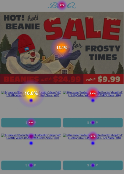
Email and its heatmap: people were clicking on product recommendations even more than on the hero banner
FAQ
- A solid ecommerce program runs on six core templates: welcome, promotional/sale, abandoned cart, post-purchase, back-in-stock, and reactivation. Larger brands often add department or category-specific versions of the promotional template. Furniture Fair built five department-specific templates and saw email and SMS revenue reach 11% of total sales.
- A template is the pre-designed structure: the layout, blocks, and styling. An email builder is the tool you use to create and customize that structure. Most modern platforms combine both: you start from a template and customize it in a drag-and-drop builder. Maestra's email builder includes dynamic blocks that pull real-time data (product recommendations, pricing, loyalty points) directly from unified customer profiles.
- Not as a standalone metric. Since Apple's Mail Privacy Protection rolled out with iOS 15 in September 2021, industry open rates have inflated significantly — the DMA's 2025 benchmark report shows opens climbed from 19% in 2021 to 35.9% in 2024, while real engagement (click rate) barely moved. For template performance decisions, rank variants by click rate, conversion rate, and revenue per recipient instead.
- The high-ROI automations to add next are: abandoned cart, back-in-stock, price-drop alerts, and a full post-purchase sequence (order confirmation, shipping, review request, cross-sell or replenishment). Replenishment matters most for consumable categories. Unidragon drives 7.4% of total revenue from a single post-purchase cross-sell flow.
- Review your templates quarterly. Look at click-through rates, conversion rates, and heatmap data to identify which sections subscribers engage with and which they skip.
- Keep your email HTML under 102KB to avoid Gmail clipping. 4ocean reduced email file size by 30% after switching to an optimized email editor, which eliminated clipping and improved load times across all email clients.
- Yes, with dynamic content blocks. Sena serves five languages plus US English from a single template using automatic language routing. Dynamic blocks swap in the right content for each recipient (banners, promo codes, product categories) without requiring separate templates per market. This approach drove 8.6x campaign revenue growth.