Conversion Rate Optimization for E-Commerce Brands: A Practical Guide to Higher Revenue
Conversion rate optimization for e-commerce is the practice of increasing the share of your existing traffic that makes a purchase by removing friction at every step of the buying decision.
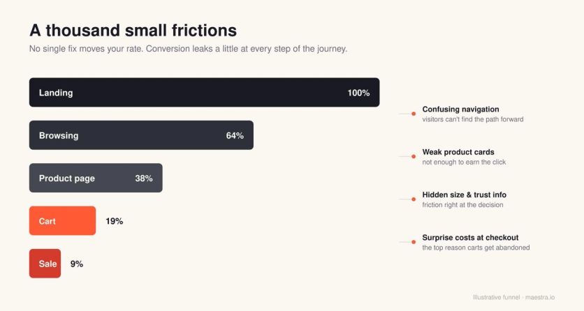
It compounds from the dozens of small choices a shopper encounters between landing and checkout, all fixed in the right order and revisited every month. The brands that compound revenue are the ones that work through that list methodically and continuously improve.
In this guide, we’ll walk you through the order we actually do it, covering what CRO is, why some brands fail with CRO, our approach, the highest-impact CRO levers, and much more. Everything we discuss below comes from our own work with hundreds of e-commerce brands.
Let’s jump in.
What is Conversion Rate Optimization? (+ What It Really Looks Like)
Conversion rate optimization in e-commerce is the practice of increasing the percentage of visitors who complete a purchase. It covers everything from page design and navigation to trust signals, product recommendations, and on-site testing. The goal is to make the buying process as seamless as possible so that more of the traffic you already have converts.
The fastest results usually come from site personalization, things like product recommendations and on-site merchandising, so that is where we start. Those changes often impact revenue within the first two to three months.
For instance, we added AI-driven product recommendations to Enlightened Equipment’s homepage, product pages, and cart, and saw website conversion rise by 15% and average order value increase by 8.7%.
From there, the program expands into email, SMS, and the continuous testing work that compounds over the rest of the year.
CRO is the cumulative effect of dozens of small decisions on every page a customer touches. This includes things like:
- Where the menu sits
- What the product card shows
- Whether the size selector is above or below the price
- Whether the trust signals are visible at the moment of purchase or buried in the footer
Each of those decisions adds a little friction or removes a little friction, and the conversion rate you see at the end is the sum of all of them.
This applies to any site type, not just traditional retail. Travel sites, subscription products, marketplaces, and B2B SaaS checkout flows all work the same way mechanically.
The job of CRO is to make sure the find-what-you-need path is as obvious and short as possible for customers. The core skill underneath all of this is data storytelling.
Behavioral data on its own is just numbers, like bounce rates, click maps, funnel drop-offs, and session recordings. The real work is turning those signals into decisions.
Why Most CRO Efforts Fail (And the Order That Fixes It)
A common mistake in CRO is treating it like a menu of tactics you pick from in any order. It is a sequence that matters more than any individual tactic, and the order is simple:
- Diagnose what is actually broken
- Fix the highest-impact basics so the site works for the average first-time visitor
- Get product recommendations right, because that is the single biggest lever you have
- Test the things you cannot judge by eye
- Personalize for them, only after you know which groups of users are still struggling
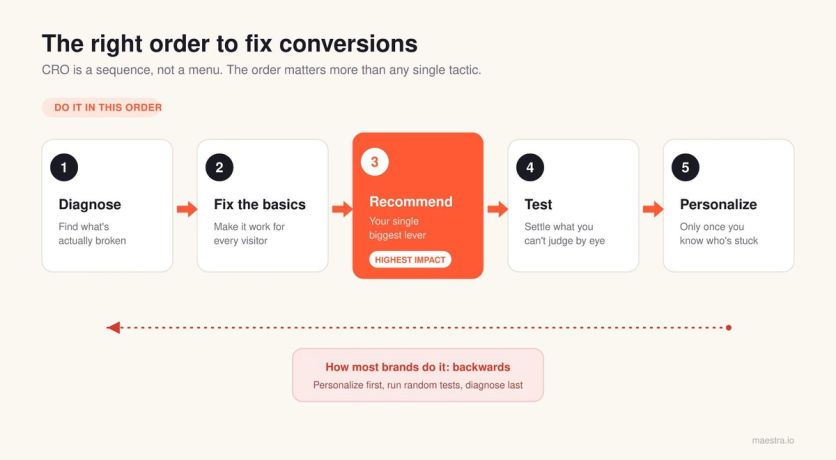
Most brands get this wrong and do things in reverse. They buy a personalization platform before their mobile product page works. Or they run a dozen A/B tests before they have looked at their own site on a mobile device.
Pro tip: If the only CRO work you’re doing is running A/B tests, you’re skipping most of the job. The majority of wins come from fixing things you can see with the naked eye, before you test anything.
What We Do in the First 10 Days With a New Client
Every new engagement with Maestra starts the same way. Before we touch anything, we want to understand where the problems are. Merchants are managing dozens of competing priorities at once, so our job is to bring a structured outside view of what will move revenue the fastest.
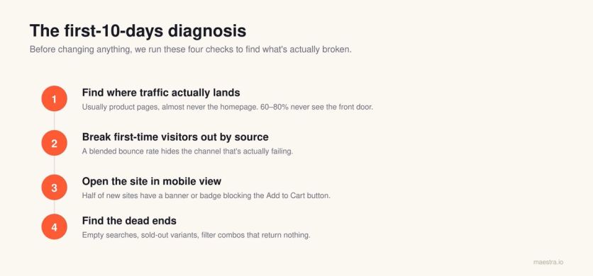
Find where traffic actually lands
Most operators assume their homepage is the front door, but in our experience, that’s not usually the case. For a typical e-commerce store, 60-80% of organic and paid traffic lands directly on product pages, or sometimes on collection pages. But almost never on the homepage.
This impacts where brands should be focusing when it comes to CRO. If you optimize the homepage when 77% of visitors never see it, you are working on the wrong problem.
Sena, a motorcycle and cycling gear brand, ran into this exact issue. Their sales promotions only appeared on the homepage, but most of their traffic was landing on product pages and collection pages.
Shoppers never saw the promotion. When they added sticky banners that kept the sale visible on every page, Memorial Day revenue grew 5.6x. The fix was to make the existing promotion visible so that visitors could actually see it.
Break first-time visitors out by source
Repeat visitors have already decided they like you, so they convert at higher rates, almost regardless of what you do. The real CRO work is for the people who don’t know you yet, and within that first-time group, performance varies wildly by source.
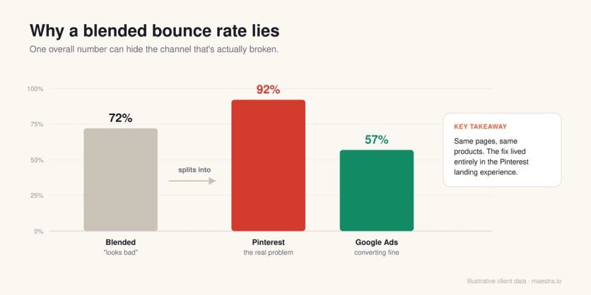
Paid social visitors behave nothing like organic search visitors, who in turn behave nothing like email traffic. This is also where aggregate numbers lie to you.
For example, a 72% overall bounce rate sounds bad, but it often hides a 92% bounce from one channel and a 57% bounce from another, and that 92% channel is where the actual problem lives.
We once had a client whose Pinterest traffic was bouncing at 92%. While the same product pages converted fine for Google Ads, the identical pages and products performed completely differently because the intent behind each visit was so different. The fix lived entirely in the landing experience for Pinterest.
Svaha USA built their CRO around this principle. They run an evergreen “Buy One, Get One 50%” ad on a rotating set of dresses. Visitors who click through from that ad see the BOGO badge on every qualifying product page, plus a link to the full collection.
Everyone else sees a clean product page with no mention of the offer. The experience matches the intent behind the visit, and the promotion stays tied to the source that brought them in.
Open the site in mobile view immediately
This step sounds obvious, but it rarely happens. Most founders know they should be checking their site on mobile regularly, but between managing inventory, running ads, and handling customer issues, it can be difficult to get to and tends to slip down the priority list.
When we do it for them, we usually find cookie banners covering the Add to Cart button, trust badges that vanish behind a sticky header, or product images loading at the wrong aspect ratio.
At least one of those problems shows up on roughly half of new client sites within the first hour.
Find the dead ends
Anywhere a user stops moving forward is a drop-off risk. That might be a search that returns no results, a size variant that’s out of stock with no alternative suggested, or a category page where two filters combined return zero products.
Every one of those is a wall, and a wall is where people leave. Product recommendations are one of the fastest fixes for these dead ends.
A “you might also like” block on a sold-out product page, bestsellers on a 404 page, or popular items on an empty search result all keep the shopper moving instead of bouncing. Enlightened Equipment added recommendations to all three and saw a 15% lift in website conversion.
How to Prioritize Your First CRO Fixes
Once you know where the problems are, you have to decide what to fix first. Not everything is worth your time, and the order you tackle things in matters as much as the fixes themselves.
Prioritize by potential (1–10 ranking)
Always prioritize by potential, which means the highest-traffic pages and the highest-value audiences come first. A 7% improvement on the page that gets 63% of your sessions beats a 52% improvement on the page that gets 2%.
It sounds obvious, but it is routinely missed when teams start optimizing without looking at traffic distribution first.
This is roughly how we rank common CRO surfaces on a 1-10 scale of where to spend your time, assuming a typical mid-market e-commerce store.
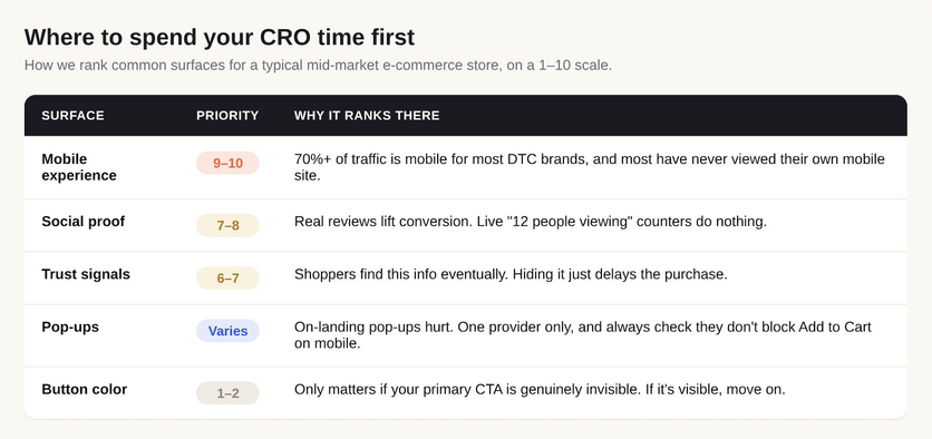
Mobile experience (9–10)
If 70% or more of your traffic is mobile, which is the case for almost every direct-to-consumer brand, the mobile experience is the single highest-priority thing to look at.
Most brands have genuinely never seen their own mobile site, so open it up, scroll through the whole thing, and try to add a product to the cart the way a customer would. You’ll find issues.
Social proof (7–8)
Reviews on product pages are also important, and the difference between having social proof and having none of it is a real lift. The format matters less than most people think, and what works depends on the product.
High-consideration purchases benefit most from detailed reviews, while impulse-friendly categories can see real lifts from real-time activity signals.
Blossom Flower Delivery added “X people are viewing this product” and “X items sold in the last 24 hours” badges to their product cards. Over 50,000 sessions, the social proof variant lifted revenue per session by 34%.
Trust signals (6–7)
People will find this information eventually, so making it hard to find doesn’t prevent them from learning it. All you’re doing is delaying their purchase decision while they go looking for it.
For example, BlueQ had their free shipping threshold buried in the site header and their return policy hidden in the FAQ. They moved both next to the buy button alongside brand values like employee-owned and USA-based production.
Nothing on that page was new information, but adding key purchase information right next to the buy button where customers make decisions helps improve conversions.
Pop-ups (variable)
In our experience, immediate on-landing pop-ups are counterproductive. That’s primarily because a visitor who has been on your site for three seconds hasn’t done anything yet, and you’re interrupting them before they’ve even decided to stay.
JOLYN took the opposite approach. Instead of showing every visitor the same 10% discount on arrival, they use AI to determine the right moment to show a popup and the minimum incentive needed to convert each visitor.
Some see 15%, some see 10%, and some see no discount at all. Popup submissions rose 21%, and revenue per user increased 22%, while margins stayed intact because discounts only went to shoppers who needed them.
Use one pop-up provider rather than three, and always check what your pop-up looks like on mobile, since a cookie consent banner stacked on top of a newsletter pop-up and a shipping promo banner can physically block the Add to Cart button on a phone. For more form types that convert, see these lead generation form examples.
Button color (1–2)
This is the thing every CRO conversation eventually devolves into. Button color only matters when your primary CTA is genuinely invisible against everything else on the page, so if your buy button is already visible, the color is a 1, and you can move on.
Where to place trust signals
Having trust signals is important, but where you put them on the page decides whether they have a meaningful impact on your conversion.
The following three placements are what we recommend:
Under the Add to Cart button. Essential purchase info (shipping cost, returns, warranty, exchange terms) belongs right where the decision is made. A return policy hidden in the footer won’t get enough attention to help convert customers. It’s far more effective if they see it before they click buy. In fact, unexpected costs like shipping are the top reason shoppers abandon carts.
Not in a scrolling announcement bar. That bar is for time-sensitive promotions like “20% off through Sunday.” A message cycling through “Free shipping over $75” and “30-day returns” just gets missed, especially when the bar isn’t sticky. Sena uses sticky banners that stay visible no matter where a visitor is on the site. During their Summer Sale, a single sticky banner reached 58,000 visitors and drove more conversions than two separate email campaigns combined.
Never competing for attention up top. A header stacking the logo, menu, search, cart, country selector, and a promo bar is six things fighting for the buyer’s attention before the customer has even seen a product. Pick what matters most and demote the rest.
The key is to put trust signals where the customer is already looking at the moment they need them, and they’ll do their job. If you bury them, you’re just adding steps between your visitor and the purchase.
Identifying the Highest-Impact Lever in E-Commerce CRO
Product recommendations are the single highest-impact change most e-commerce brands can make. They take little to implement, and when done well, they lift conversion more than almost anything else on this list.
Yet we often see most brands set them up poorly so they have little impact.
What product recommendations can do
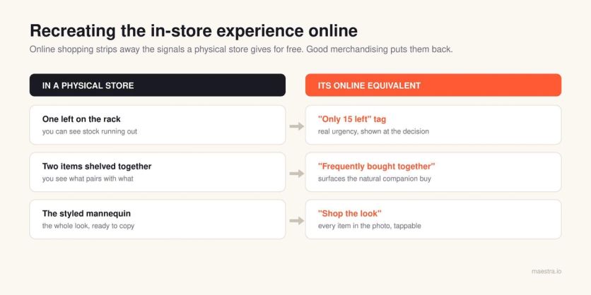
Physical stores give shoppers signals that online shopping strips away. You can see what other people are holding, what’s almost gone from the rack, what pairs with what on the mannequin, and whether the place is busy or empty.
Product recommendations, urgency signals, and guided experiences are how you replace those missing cues online. A “selling fast” tag is the digital equivalent of seeing one item left on the shelf, a “frequently bought together” widget recreates the experience of two products displayed side by side, and a “shop the look” is the mannequin.
Having recommendations vs. having good recommendations
This distinction matters more than most brands realize, because having product recommendations isn’t the same as having good ones.
A “you might also like” carousel showing random products from the same category is technically a recommendation, but it can be a useless one that has no positive impact on conversions.
The quality and the logic behind it are everything, and a bad recommendation is actually worse than no recommendation, because it tells the customer you don’t know what they want.
Treat recommendations as navigation rather than upsells
This is the framing most brands miss when they get into product recommendations. While they can be used as a way to get customers to add items to a cart, they should also help customers get around your store.
They also quietly compensate for broken or hard-to-use menus. That’s especially true on mobile, where the hamburger menu has a 5-15% interaction rate at best, and the recommendation carousels are how users actually browse your catalog.
The Nielsen Norman Group’s navigation research also found that hiding a site’s main navigation cuts discoverability almost in half and leaves people far less likely to use it at all.
Product recommendation patterns that work
Over the years, we’ve found that a handful of recommendation patterns deliver consistently, regardless of what a brand sells or how big its catalog is.
The best part is that none of them require sophisticated machine learning or a major build. They mostly come down to feeding the recommendation engine the right logic and the data you already have.
Here are the four product recommendation patterns that you can use today.
Smart bestsellers
A “best sellers” carousel is a standard feature, but the standard version has a flaw.
A product that sold well last month and is now down to its final size will keep appearing in the carousel, so the customer clicks it, lands on a product page where their size is gone, and bounces.
The fix is to filter bestsellers for availability before you display them. The carousel will look a little different, but it will actually work.
Defense Mechanisms, a tactical gear retailer with 1.8 million monthly visitors, uses Maestra to surface bestsellers on the homepage automatically while filtering for availability.
On product pages, the system pairs items based on gear compatibility, so a plate carrier shows the right cummerbund, rather than just visually similar products. Product recommendations now influence 8.9% of total sales.
Shop the look
When your product images show a model wearing the hero product alongside three or four other items, those secondary items are recommendations waiting to happen.
Shoppers who buy styled looks tend to add the secondary pieces, the earrings, the bag, and the shoes, not just the hero product.
JOLYN, a performance swimwear brand, applied this principle on their product pages. If a shopper browses a blue bikini top, they see the matching bottom in the same color, material, and size.
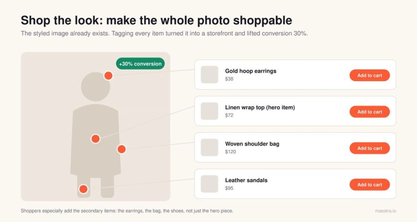
Previously, their recommendation system showed unrelated pieces or items that were out of stock in the shopper’s size. With the right matching logic in place, product recommendations now influence 7% of total sales.
Multiple angles for shopper types
Different shoppers move through your store in completely different ways. Some arrive with clear intent and head straight for search, some are browsers who need a path laid out for them, and some are returning customers who just want to see what’s new.
No single “recommended for you” widget can serve all three, so it’s worth running a few angles in parallel, like “selling fast,” “just for you,” and “bestsellers in your size.”
Different shoppers will click different ones, and you’ll learn a lot about your audience from watching which ones they choose.
Size-aware out-of-stock alternatives
When a customer lands on a product that’s sold out in their size, most recommendation engines default to suggesting similar products from the same category. That sounds reasonable until you realize those alternatives are frequently sold out in that same size, too, and the customer hits a dead end twice in the span of 10 seconds.
JOLYN had this exact problem. Their previous recommendation system would suggest swimwear pieces that were out of stock in the shopper’s size, turning one dead end into two.
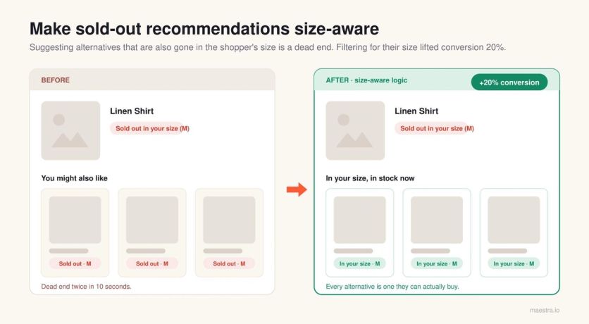
After switching to Maestra, unavailable sizes are filtered out automatically, and only in-stock alternatives appear. The logic isn’t complicated, and the data already lives in your product catalog, but it’s the kind of fix that most recommendation engines skip by default.
Real urgency vs. fake urgency
Urgency sits right next to recommendations on the page, and brands get it wrong constantly, almost always because the urgency isn’t real. Real urgency works, and fake urgency doesn’t.
“Only 15 left at this price,” shown next to the Add to Cart button, where the customer sees it at the moment of decision, has a measurable effect on conversion. “247 people viewed this product in the last hour,” slapped on every product page, does not.
People can tell the difference between a genuine signal and theater, and while the first one might nudge them off the fence, the second one just trains them to ignore everything else you show them.
Every one of these patterns removes a stopping point and gives the visitor a clear path to the next relevant thing.
How to Properly Run A/B Tests
Once the basics are fixed, you start testing. This is where you settle the questions you can’t answer just by looking at the site, and it’s also where most brands quietly fool themselves with bad data.
Three A/B testing mistakes to avoid
We see the same three mistakes on testing programs at every brand size, from $500K stores to nine-figure operations.
Running too many tests at once
When a team runs five tests in parallel on overlapping pages with overlapping audiences, users end up scattered across random combinations of variations. The environment is no longer controlled, the results aren’t isolated, and nobody can actually attribute a lift to anything.
So we tell every client the same thing, which is to run one test at a time. The only exception is when two tests cover completely different stages of the lifecycle with zero audience overlap, like a checkout test running alongside a post-purchase email test. Otherwise, queue them.
Using variations that don’t differ enough
A team tests two nearly identical headlines, the winner squeaks out a 1.2% lift, and nobody can articulate what they actually learned. When the variations are too close together, there's no real insight to pull out of the result.
Every test should have a hypothesis you can state in a single sentence, something like “if variation A wins, it means our users respond to social proof more than urgency.” If you can’t write that sentence, you don’t have a test to run.
Measuring the wrong metric
Conversion rate isn’t always the right goal, and for most of the surfaces you test on, it’s the wrong thing to look at. The right metric depends on what that part of the site is actually for:
Homepage tests should look at bounce rate or click-through to category and product pages, because a homepage’s job is to move a visitor to the next step rather than close a sale.
Product recommendation tests should look at the add-to-cart rate, since that’s what the recommendation directly influences.
Trust-building tests should look at first-order delay, the number of days or sessions between a customer’s first visit and their first purchase. When that number drops, you’re building trust faster.
The most expensive version of this mistake is the “Buy Now” versus “Add to Cart” trap. A team switches to a “Buy Now” button, watches conversion rate climb, and declares a win.
But with that, they usually don’t notice that the average order value dropped by two-thirds because nobody adds a second item to a one-click-buy flow. That also results in a drop in total revenue.
Just because the conversion rate went up doesn’t mean the optimization was effective. This is the result when teams run tests without being able to articulate what they’ll learn from the result. If you can’t state the hypothesis, don’t run the test.
Note: A lift in conversion rate that drops AOV or total revenue isn’t a win. Pair every primary metric with a revenue guardrail before you call a test.
How long to run an A/B test
Test duration isn’t an arbitrary calendar window. You run a test until it reaches statistical significance, and you don’t stop early just because you have a hunch about which way it’s going.
A reasonable minimum is usually two weeks, which captures a full weekly cycle, including weekend versus weekday behavior. But two weeks is the floor, not the ceiling, so if you haven’t hit significance yet, keep it running.
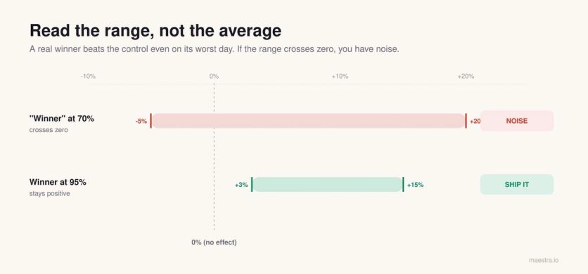
What you're looking for is a min-max confidence range. On the worst day of the test, the variation should still beat the control, and on the best day, it should beat the control by more.
If your range is “anywhere from -5% to +20% with 70% confidence,” you don’t have a winner, you have noise. A real winner looks more like “+3% to +15% with 95% confidence,” and that’s something you can confidently ship.
One more thing before you start. Plan the test window so that nothing major runs alongside it and contaminates the result, since any of these will quietly skew your numbers:
- Site-wide changes to design, navigation, or pricing
- Big promotions or seasonal sales that distort normal buying behavior
- PR cycles or campaigns that send in traffic, unlike your usual mix
And we recommend resisting the urge to stop a test early just because the first numbers look good. This is a trap Evan Miller’s analysis shows, which pushes your false-positive rate to 26.1%.
Early data is noisy, and conversion rates on day three can swing 30% from natural variation alone. If you regularly call tests too early, you’ll keep crowning “winners” that don’t replicate when you ship them sitewide, and after a year, you’ll have shipped a stack of changes that net to zero.
Why Personalization Should Be the Last Thing You Do
Personalization is the last step in the sequence, and that’s deliberate. Most marketing content treats it as the opposite of CRO, as if CRO is about the average experience and personalization is about the individual, and you have to pick one.
That framing is wrong because personalization is simply one of the tools you use to improve conversion. It is CRO in every practical sense:
- A personalized product recommendation that lifts the add-to-cart rate
- A geo-targeted shipping message that reduces checkout abandonment
- A returning-visitor experience that surfaces the category someone browsed last time
The reason it comes last is that you can’t personalize your way out of a broken baseline. If your product page doesn’t work for everyone, personalizing the hero image for returning visitors won’t save you.
We’ve seen brands pour six figures into personalization platforms while their default mobile product page still has a cookie banner covering the Add to Cart button. The platform isn’t the problem here. The problem is that they personalized before they fixed the baseline.
Four personalization traps to avoid
When brands jump ahead to personalization too early, they tend to fall into the same four traps every time.
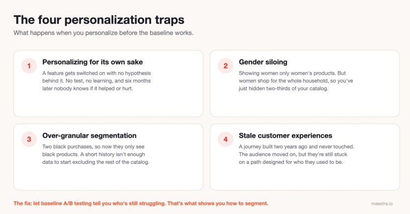
Personalizing for its own sake
A brand turns on a feature because the platform offers it, not because there’s an actual hypothesis behind it. There’s no test and no learning, so the experience changes and the team has no way to know whether it helped or hurt.
Six months later, the personalization is still running, and nobody can tell you whether the conversion rate is better or worse because of it.
Gender siloing
This one is endemic in fashion, where brands segment visitors by gender and show women only women’s products and men only men’s. However, the data doesn’t support it.
Women tend to shop for everyone in their household, including themselves, their partner, their kids, and their parents, while men, on average, mostly buy for themselves.
That asymmetry matters, and restricting a female visitor to a third of your catalog because she ticked “female” on a sign-up form quietly costs you orders.
Remember: Women shop for their whole household, not just for themselves. Gender is one of the worst attributes to silo your catalog by.
Over-granular segmentation
A brand notices that a visitor has bought black items twice in a row and starts showing them nothing but black products. Unless that person exclusively buys black, which they almost never do, you’ve now narrowed their view of your catalog based on a pattern that isn’t real.
The same logic applies to color affinity, brand affinity, and any other narrow signal. A two-purchase history simply isn’t enough data to start making exclusionary decisions.
Stale customer experiences
A merchant builds a personalized journey two years ago, ships it, and never touches it again. But the user base changes, the product catalog changes, and the reasons people first signed up stop being the reasons they keep coming back.
Meanwhile, those customers are stuck on a path designed for a version of the audience that no longer exists.
Allow testing to tell you how to segment
The correct order, and the reason personalization sits at the end of this guide, is to run baseline A/B testing first. That testing shows you which groups of users are still struggling after you’ve optimized the average experience, and that’s what tells you how to segment.
Segmentation should fall out of the data, not out of a workshop where someone decided there are five personas and the team should build an experience for each one.
Where to Get Started Today
Pick the one thing here that applies to you most directly and do it before anything else.
If you haven’t opened your own site on a phone in the last month, do it today, try to add a product to the cart, and fix every point of friction you hit along the way.
If your product recommendations aren’t size- or stock-aware, fix that logic this quarter, because the data is already in your catalog and the lift is real. And if you’re running several A/B tests at once on overlapping pages, stop and queue them, since the results you’ve been collecting can’t be trusted.
Conversion rate optimization isn’t glamorous work. Instead, it’s more about a series of small fixes done in the right order, measured honestly, and shipped consistently.
The brands that stick with that for two or three years build a real revenue advantage over the ones still chasing a single magic fix, and there is no single magic fix.
If you want to run this diagnostic on your own store, Maestra’s platform handles the data collection, segmentation, and testing from day one. Book a demo and see what the first 10 days look like.