Shoppers Who Engage with Recommendations Have 28.7% Higher AOV at Blue Q


Integrated with:
Results
- +28.7%
higher AOV
- +45.3%
more items per order
Testimonial

Homepage
Personalization begins on the homepage, with a different content strategy for different audiences. New visitors see best sellers to quickly understand what the brand is known for. Returning visitors see personalized picks based on their browsing and purchase history. The first three products are always full-priced to avoid recommendation loops dominated by discounted items.
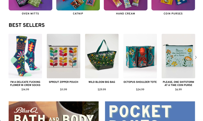
On the homepage, new visitors see bestsellers…
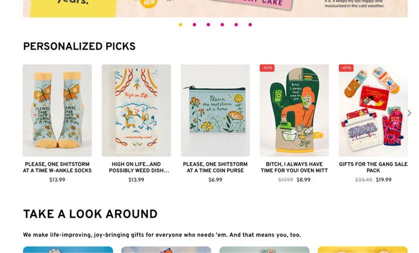
…and returning visitors see personalized picks based on their history
Beyond recommendations, Maestra powers the announcement bar — keeping active promotions visible and adding a countdown timer when an offer is time-sensitive.
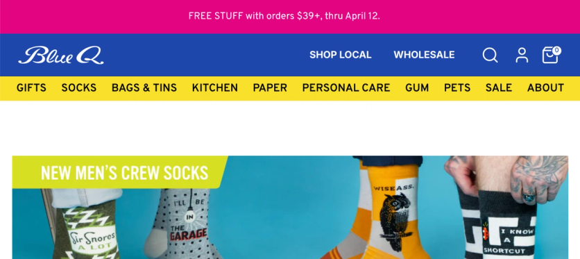
The announcement bar promotes the current offer while the rest of the homepage showcases new arrivals
Product Page
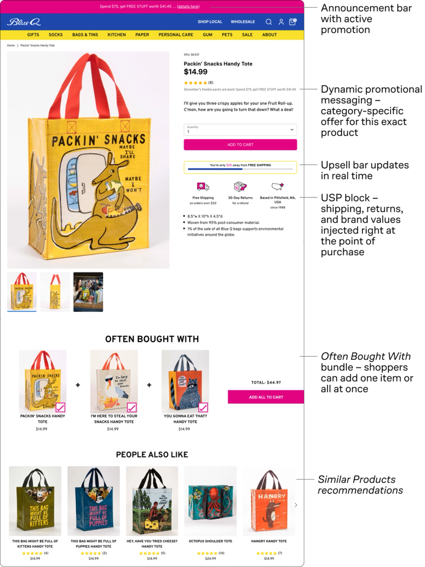
The product page is where most buying decisions happen — and before Maestra, Blue Q’s PDPs were missing critical elements to help shoppers commit. Return information was buried in the FAQ. Free shipping details were barely visible in the site header. Promotional offers appeared as generic messages across every product — even the ones excluded from the deal.
Maestra rebuilt the product page experience from the ground up. Here’s the full picture:
Now let’s break down each element in detail.
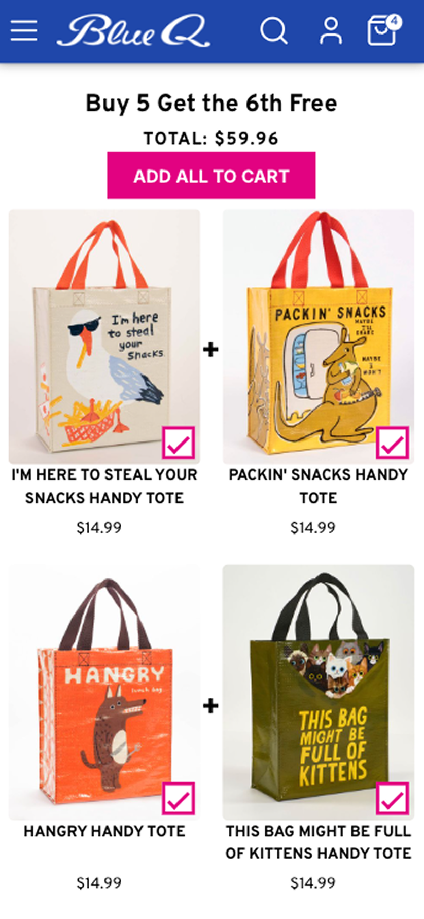
Dynamic Promotional Messaging
Each product page now shows whether the item qualifies for the current promotion:
- Qualifying items show category-specific messaging. If a shopper is browsing a bag during a “buy 5, get 6th free” sale, they see “buy 5 bags, get 6th free.”
- Discounted items display the original price crossed out and the new price highlighted — making value and urgency clear at a glance.
- Excluded items now state “sale item excluded from offer”, preventing disappointment at checkout.
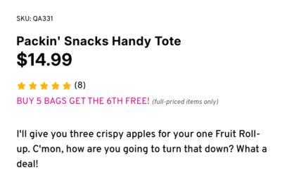
During a “buy 5, get 6th free” sale, the messaging is category-specific — bag shoppers see “buy 5 bags, get 6th free”
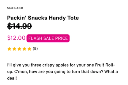
During a flash sale, the original price is crossed out and the new price is highlighted
USP Injection
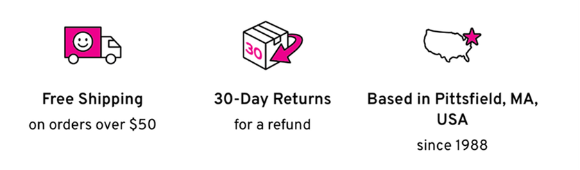
Before Maestra, key purchase signals were scattered across the page: free shipping details buried in the header and return policies hidden in the FAQ.
This is a common mistake — many brands use their announcement bar to highlight free shipping, leaving little room for actual promotions or announcements.
Instead, we moved essential purchase information directly next to the buy button, where customers are making their decision. Now shoppers immediately see the free shipping threshold, 30-day return policy, and brand values like employee-owned and USA-based production – while the announcement bar remains free for promotional messaging.
Upsell Bar
The upsell bar adjusts dynamically to whatever promotion is running at the time. The evergreen version nudges shoppers toward free shipping. During major promos like Blue Q’s occasional FREE STUFF giveaways, the bar transforms into a countdown toward free gifts — or higher-tier rewards.

The evergreen upsell bar nudges shoppers toward free shipping
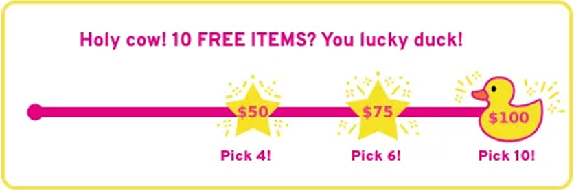
During Black Friday the upsell bar highlighted free items, helping to maximize the impact of the once-in-a-lifetime Pick Your Own FREE STUFF promo
“Often Bought With” Bundles
Bundles featuring complementary products appear directly on the product page and are the strongest-performing recommendation mechanic. Each bundle surfaces two additional items that pair naturally with the product currently being viewed.
This mechanic alone drives 40% of all recommendation-influenced revenue.
Similar Product Recommendations
AI-driven “People Also Like” recommendations at the bottom of the product page make sure no interested shopper leaves without seeing alternatives
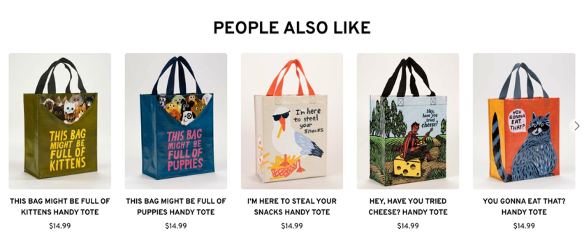
People Also Like recommendations help shoppers discover alternatives
Minicart
Blue Q redesigned their minicart with a partner development agency. Maestra powers two elements inside it: the upsell progress bar and Impulse Buys — small items under $10 that appear at checkout, the digital equivalent of the checkout aisle.
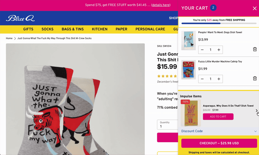
The minicart slider with an upsell progress bar and impulse buy items — small add-ons under $10 that mimic the checkout aisle experience
The Bottom Line
Blue Q didn’t add more products or run deeper discounts. Instead, they redesigned the customer journey. Every touchpoint was rebuilt to keep shoppers engaged, show applicable promotions, and surface products they might otherwise have missed.
Shoppers who engage with Maestra-powered sections show a 28.7% higher AOV — driven not by pressure or discounts, but by a shopping experience that simply works better.
More Case Studies on On-Site Personalization
Check out more case studies on how to boost AOV and conversion with on-site personalization:
- Enlightened Equipment Boosts Average Order Value by 38.7% Using Smart Upsell Bar
- 5.6x Growth in Memorial Day Sales Revenue: Sena Boosts Sales Discovery with Sticky Banners and Targeted Emails
- JOLYN Drives 7% of Sales with Assistance from Product Recommendations
More Wins From Blue Q