Svaha USA Builds a Personalized Sale Page That Converts 3x Above the Site Average


Integrated with:
Switched from:
Anniversary Sale Results
- 3×
conversion rate
- 3.5×
add-to-cart rate
- 2.6×
session duration
- −50.8%
bounce rate

How One Page Makes the Whole Sale Easy to Shop
During one of Svaha’s sitewide sales, their Forward Deployed Marketer spotted a way to make the promo work harder. Hundreds of prints were on discount, but there was no single place to shop them – so she suggested building one.

Svaha created a blank page on their Shopify site, and their Maestra marketer filled it with embedded blocks:
- a hero banner with the sale’s offer,
- navigation shortcuts by theme, product category, and discount depth,
- sale-only product recommendations: personalized, bestsellers, recently viewed.
The blocks adapt the sale to how each person shops: a discount hunter heads straight for the deepest markdowns, a theme shopper goes right to their favorite prints. And the merchant still gets to feature the collections they most want to sell.
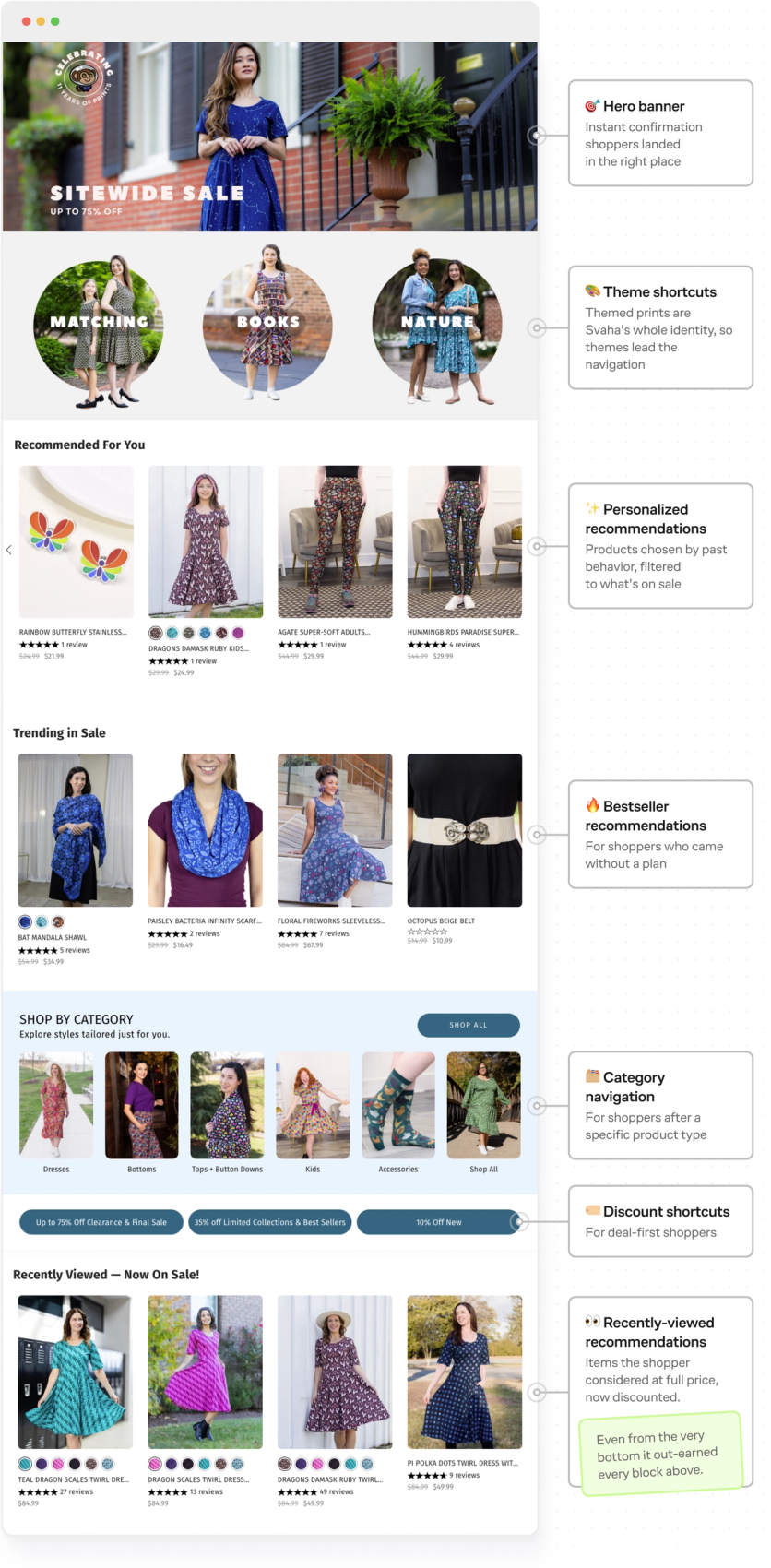
Most of the sale page’s performance came from its recommendation blocks. The standout: Recently Viewed – Now On Sale. These are the highest-intent products on the page – the shopper has already considered them, and the new price is a reason to return. The team first placed the block at the bottom, and it still drove more revenue than any block above it, so now it always goes at the top.
The result: sale-page sessions added to cart 3.5 times more often than the site average, and converted 3 times more often. And beyond conversion, it’s just a nicer way to run a sale – shoppers are guided straight to their deals instead of digging for them.
How a One-Off Page Became the Default for Every Sale
Svaha has already rerun the format for back-to-school, reshuffling the same embedded blocks around a new hero and new category shortcuts. Shortcuts like Kids Only and Teacher’s Corner split the sale by who’s shopping; a school-subject row goes further, so a teacher can dress for the class they teach. The shortcuts can slice the catalog whichever way fits the shopper’s intent and the idea of the sale itself.
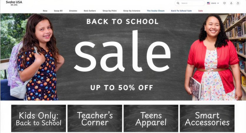
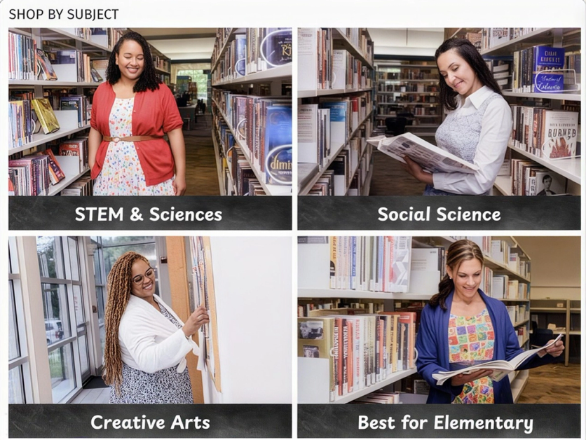
The back-to-school page again beat the site averages: an add-to-cart rate 2.2× the site average and a 42% higher conversion rate.
A BFCM version is already in the works – this time with category shortcuts that change per shopper, so the kids' button shows only to customers who browse or buy kids' styles.
The Bottom Line
One landing page gave a sprawling sitewide sale a clear starting point: every visitor lands on a page arranged around what they’ve browsed and bought – and what’s trending with everyone else. Sessions that started there converted at three times the site average.
It turns out even a familiar sitewide sale leaves room for a better shopping experience – especially when the idea comes from a Forward Deployed Marketer who already knows the catalog and the shoppers.
More Wins From Svaha USA
Svaha USA Grows Total Sales by 26% After Consolidating Their Entire Marketing Stack