12 STOREEZ Generates Over 30% of Its Revenue Through Direct Communications. 6 A/B Tests and Their Results.
Figure out why certain customers are not reading emails .
Survey for inactive subscribers .
Integrated with:
- 30.43%
of the total revenue is generated by direct communications. Data is collected in Maestra's Campaign Dashboard using the last-click attribution method
On average, each 12 STOREEZ customer receives 35 bulk, trigger, and transactional campaigns per month. In order to increase the efficiency of these campaigns and boost the revenue from direct communications, we carried out 6 A/B tests for the following hypotheses:
- The conversion drops if there is a product recommendation widget in the abandoned cart email.
- The click rate increases if the abandoned browse web push notification contains the customer’s name.
- The open rate increases if there are emojis in the email subject line.
- The shorter the email, the higher the click rate.
- The shorter the journey to the target action, the higher the conversion rate.
- The click rate increases if there is a photo of the item in a “Back in Stock” mobile push notification.
Keep reading to find out how we formulated these hypotheses, calculated our A/B tests' reliability, as well as what unexpected conclusions we came to. Maria Vesyolkina, 12 STOREEZ’s CRM Marketer, explores all this — and more — below.
Why we launched so many A/B tests
We use 5 communication channels at 12 STOREEZ: email, mobile push, SMS, web push, and push notifications via digital loyalty cards. What’s more, our marketers send 5 digest emails per week. As a result, our audience receives a lot of communications — each customer gets 35 campaigns per month on average (including transactional and service messages).
- 0.1%
unsubscriptions per month
At the same time, our customers have the freedom of choice in that they can choose the topics they like (for example, new items, stories, or sales) on the page dedicated to subscriptions. This allows us keep the unsubscribe rate at 0.1% per month.
In August, we noticed a slight dip in customer activity and revenue from email campaigns. In response, we audited the campaigns and started working on improving the effectiveness of each one. Six A/B tests were launched to assess this. In the future, we plan to abandon bulk campaigns and turn to trigger-based sequences instead.
How we carried out the A/B tests
We use the A/B test reliability calculator before launching A/B tests. To determine the number of participants we need, we enter test parameters such as the expected uplift, number of variants, power, the desired realibility score and our current baseline in the metric that we’re testing. On average, we need 17,000 people to test bulk campaigns.
The test duration depends on the type of campaign we’re trying to evaluate and whether it is a trigger-based or bulk campaign. We can usually evaluate the results of a bulk campaign 3 hours after launching the test, whereas trigger-based campaigns need some more time and we can view their results 7–14 days post-launch. When testing trigger emails in Maestra, we get a notification email once the necessary amount of test messages has been sent out.
We run every test 5–10 times in order to confirm its results.
The hypotheses we tested
Hypothesis 1. The conversion rate drops if there is a product recommendation widget in the abandoned cart email
An abandoned cart campaign is sent out if a customer has added items to their cart and left the website. We doubted whether any recommendations should be added to these campaigns, as well as whether the conversion rate drops once there are too many buttons in the email.
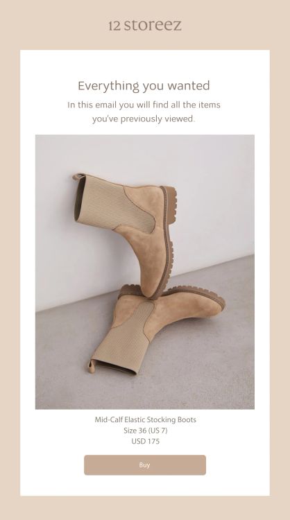
Variation 1. The email contains only a reminder about an item in the cart
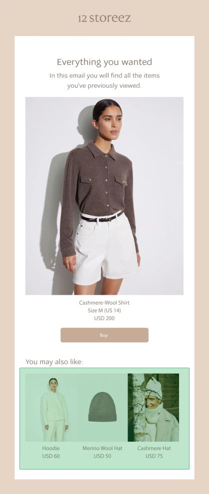
Variation 2. The email reminds customers about the items in the cart and recommends other items that may interest the customer and go great with their outfit
This hypothesis failed.
In this email, product recommendations didn’t affect the order conversion rate:
Hypothesis 2. The click rate increases if the abandoned browse web push notification contains the customer’s name
The abandoned browse web push notification is sent if a customer viewed an item but didn’t add it to their cart and left the website. We were convinced that including customers’ names in push notification would increase the click rate.
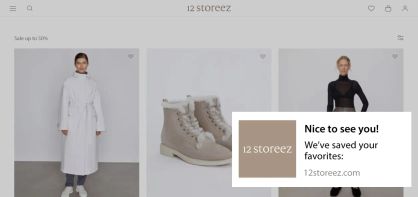
Variation 1. Nameless message
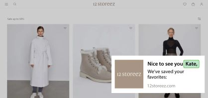
Variation 2. Customer addressed by name
This hypothesis failed.
Including customer names in the web push notification doesn’t affect the click rate.
I was surprised that the use of customer names didn’t have any influence on the click rate. This goes against our general understanding of the way customers respond to communications. This result may be due to the fact that we tested web push notifications and the situation may be different for other channels. In any case, we shouldn’t jump out of the frying pan into the fire and delete customers’ names from our communications after only one test. We’ll need to carry out several tests for different channels.
Hypothesis 3. The open rate increases when the subject line includes emojis
We used to add emojis to every email’s subject line — we believed that this could increase the open rate. So we decided to run an A/B test to confirm this.
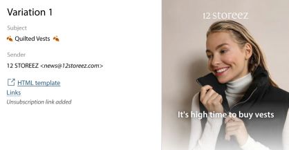
Variation 1. Emojis in the subject line
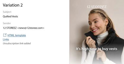
Variation 2. No emojis in the subject line
This hypothesis failed.
The open rate is higher for emails without emojis.
It is possible that users perceive these emails as spam due to the fact that a lot of companies add emojis to their emails. An email without emojis seems to be of more importance.
Hypothesis 4. The shorter the email, the higher the click rate
We send our customers long emails with a selection of outfits created using our brand’s items. Under every outfit, there is a description of the items, ideas on how to mix and match items, and the best occasions to show off these looks. We decided to test whether showcasing one look at a time works better or if customers prefer a selection of several looks.
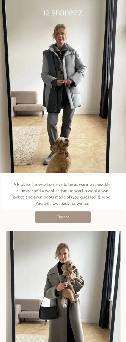
Variation 1. The email includes 5 outfits. The customer simply needs to click the “Choose” button under the photo and the text will expand with a description of the outfit
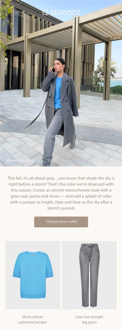
Variant 2. This campaign contains just one outfit
This hypothesis was confirmed.
The shorter email received almost twice as many clicks.
Hypothesis 5. The shorter the journey to the target action, the higher the conversion rate
New customers are displayed a pop-up that collects email addresses. They are asked to subscribe and get an email with a playlist for their morning run. The first group was given the option to enter their email address straightaway. The second group was offered the playlist first and only then asked to leave their email addresses. An extra CTA button is the only difference between the pop-up types, whereas the text and image remain the same.
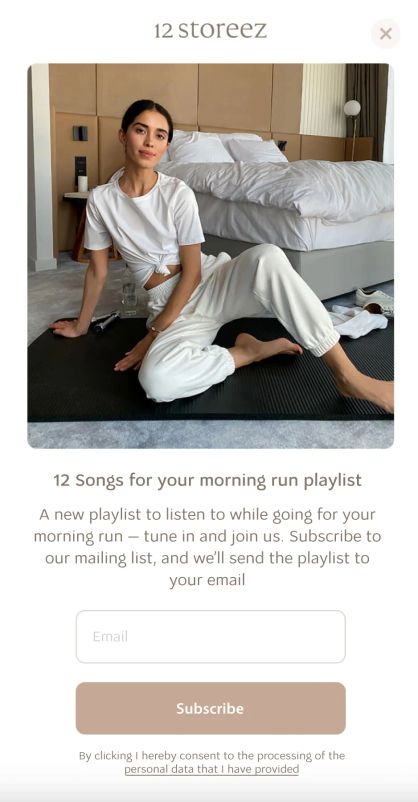
Variation 1. We asked the customer to enter their email straight away
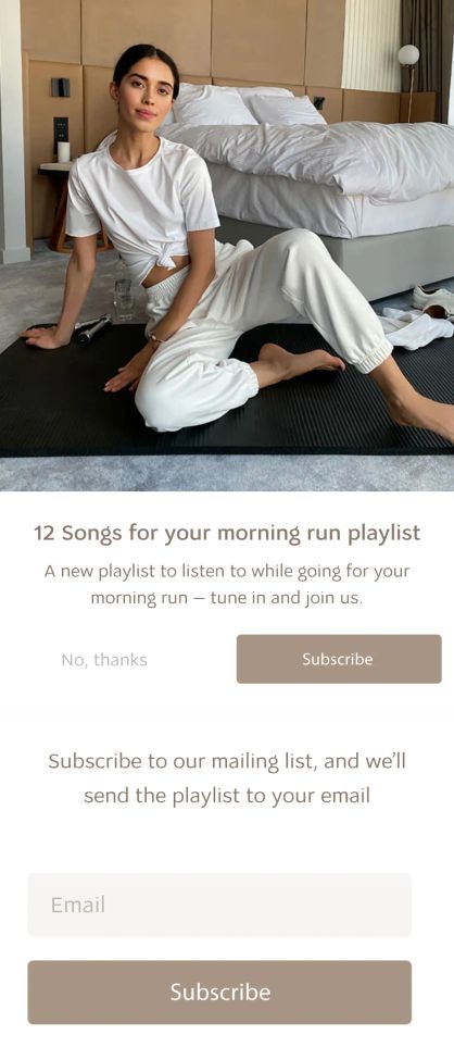
Variation 2. We offered access to the playlist first, then asked customers to subscribe to our mailing list
This hypothesis failed.
The pop-up with the extra button generated more contact information.
This A/B test was a revelation for me. Now I want to see whether the same principle applies to other pop-ups and campaigns. As marketers, we’re taught that if you want to get something from a customer, you should ask for it right away and redirect them to your website or app. The test, however, proved that this is not always true.
The more “premium” a segment is, the more independent a customer wishes to be. These customers understand what they need, so it’s better to let them choose. This may have influenced the test results.
Hypothesis 6. The click rate increases if we feature the product in the “Back in Stock” mobile push notification
When a product becomes available again, a customer receives a “Back in Stock” notification after they’ve signed up for it. This could be a text message, an email, or a mobile push notification. We assumed customers would find it useful to be reminded of what the products look like. To verify the hypothesis, we sent 2 types of mobile push notifications that contained identical texts.
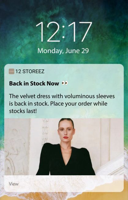
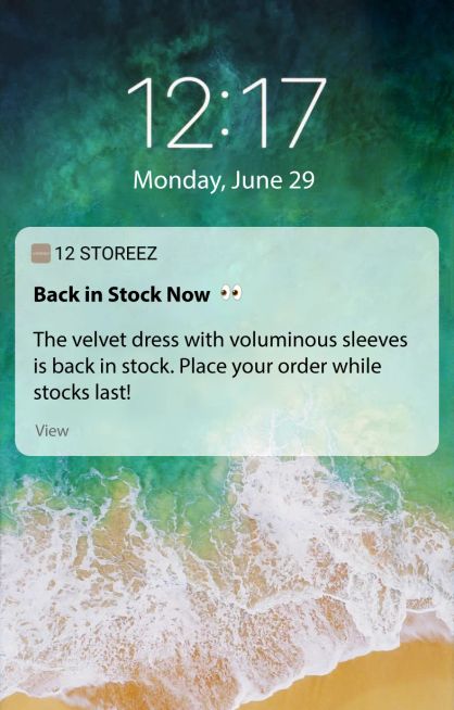
This hypothesis failed.
Customers are more keen to tap text-only mobile push notifications. Their click rate is 1.7% higher than that of push notifications that feature an image.
A/B test results
A/B tests helped us discover that:
- the conversion is not affected by the product recommendations widget in the abandoned cart email
- the click rate is not affected by inserting the customer’s name in web push notifications
- emails have a higher open rate if there are no emojis in the subject
- short emails have a higher click rate than longreads
- if there are several buttons in a pop-up, customers are more willing to share their emails
- text-only “Back in Stock” push notifications have a higher click rate than those with an image
Questionnaire for customers who stopped opening emails
We sent a questionnaire to customers who hadn’t opened our emails for half a year, asking them what was wrong. Customers were able to choose one of the five options in the questionnaire. On top of that, they could also leave a comment.
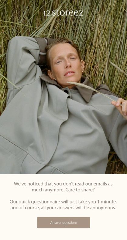
The email was sent to customers who hadn’t opened emails for 6 months
- 905
clicks
- 207
comments
- 28
orders
Sent
83,904Delivered
99.1%
Open rate
15.2%Click rate
4.2%Unsubscriptions
0.7%
It was a surprise to receive 207 detailed answers from customers. They definitely wanted to help improve our campaigns. The questionnaire doesn’t redirect them to the website or the app. Nevertheless, we generated 28 orders from the segment of customers who hadn’t read our emails for half a year.
Trigger-based “You’ve Been With us for Half a Year” email
We are currently getting ready to launch an automated “You’ve Been With us for Half a Year” reactivation email.
In these emails, we’ll tell the customer how much we have achieved together: how many emails they read, how many orders were delivered, and how many times they visited our website. We were inspired to create this sequence by other brands (such as Spotify with its “Spotify Wrapped” year-in-review for users).
The “You’ve Been With us for Half a Year” email wasn’t created to increase sales, but to stimulate customer loyalty and foster warm and friendly relationships with our customers.
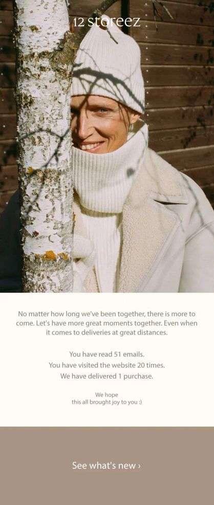
In this email, customers discover how many campaigns they read, how many orders were delivered, and how many website visits they made over the course of 6 months.
P. S. In this story, we talked about our Customer Data Platform (CDP). You can read about this module on our website or talk to someone from our team to learn more about the product.


